Client: ShedWool
Role: UI Designer
Deliverables: style tiles, high-fidelity mockups, prototype and style guide
Timetable: 3 weeks
Tools used: Photoshop, Illustrator, Sketch and Proto.io
Starting Off
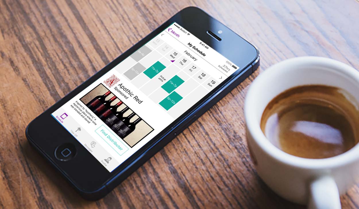
ShedWool helps you manage your schedule and message employees for the service industry.
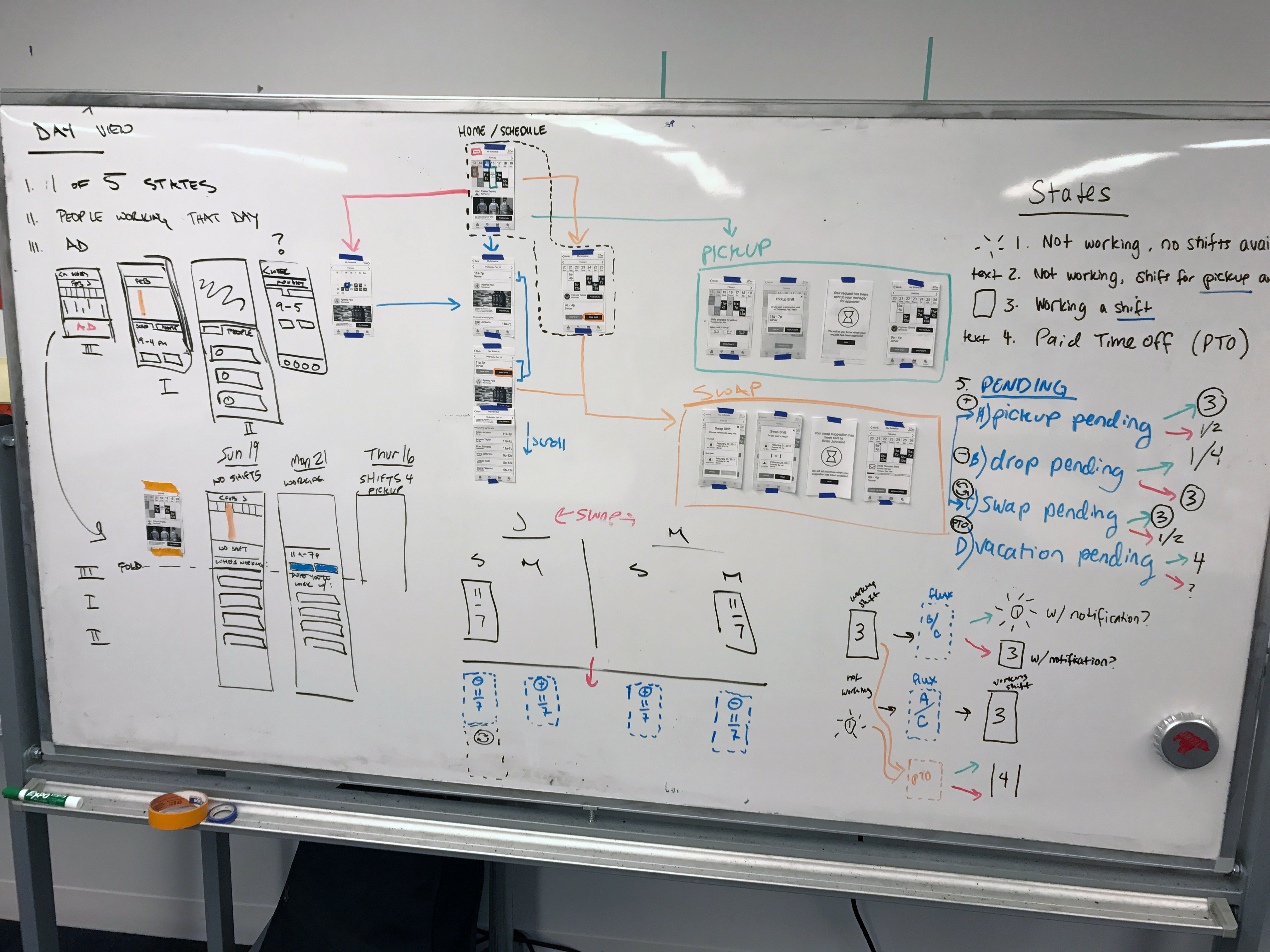
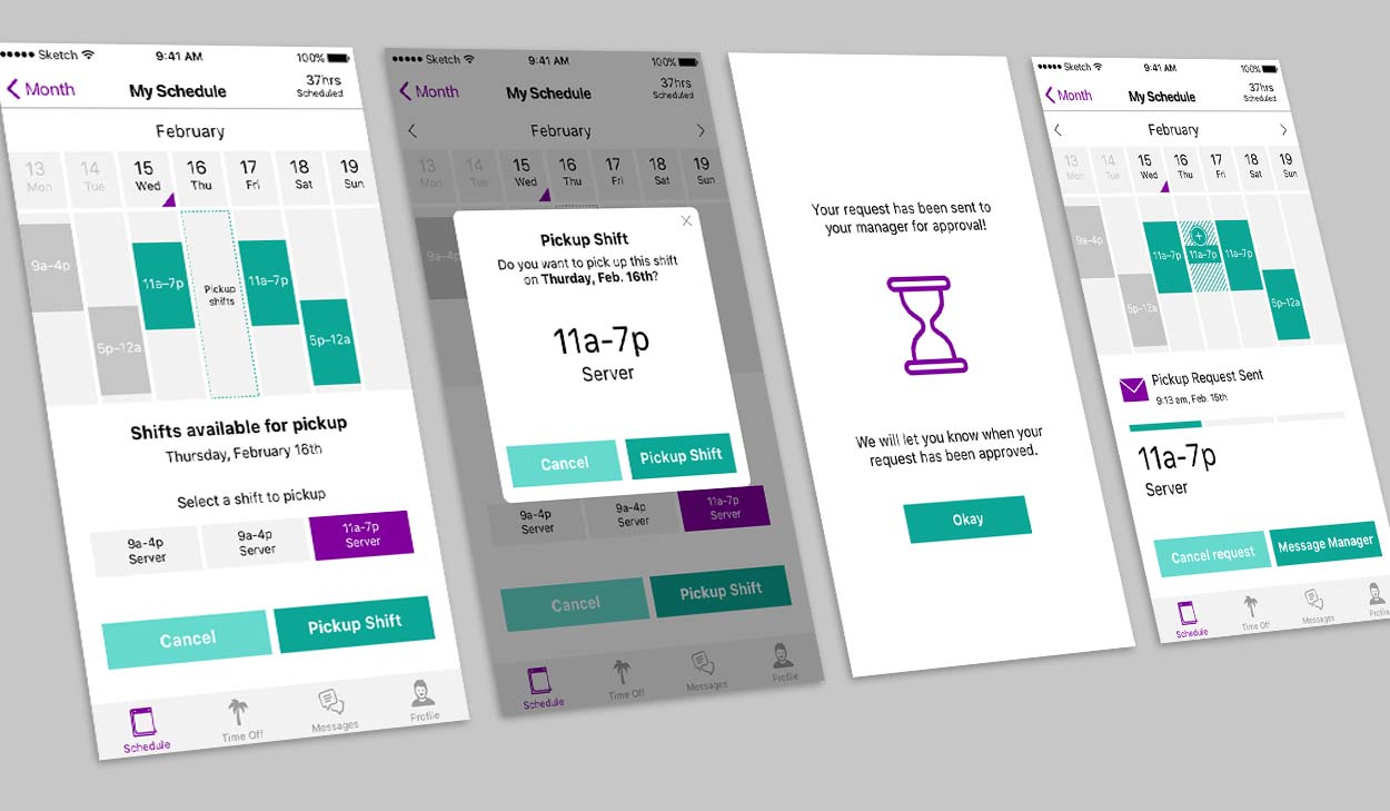
We received wireframes from the UX team. Although the ux team was thorough there were still some unanswered questions regarding the different states of the schedule and the flows
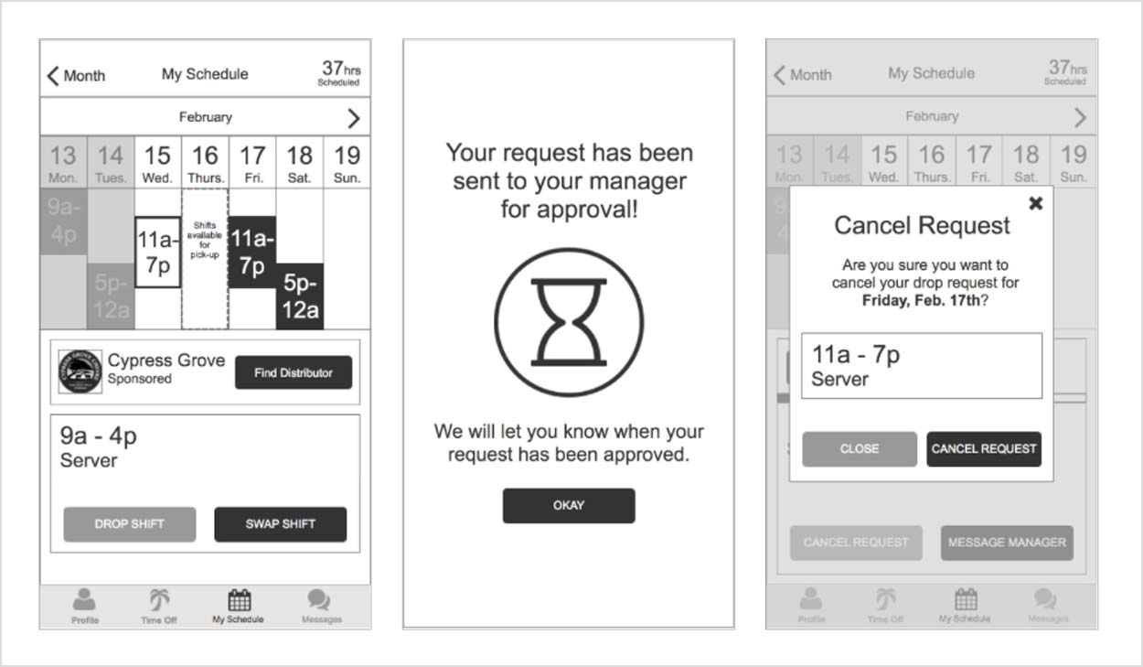
To understand the functionality of the app we spoke with the ux team and we broke down the flows into pick up drop and swap as well as the different states of the calendar.
For the 20 second gut test, we presented a variety to slides to gauge client reactions and find direction for our designs.
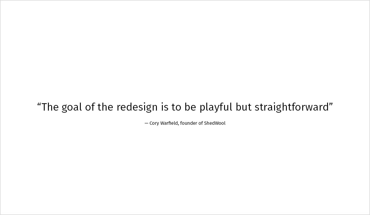
Adjective exercise to gauge key words that described and didn’t describe the shedwool brand.
Insight from the client.
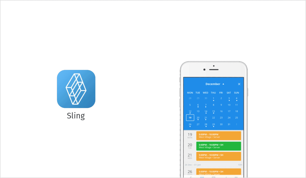
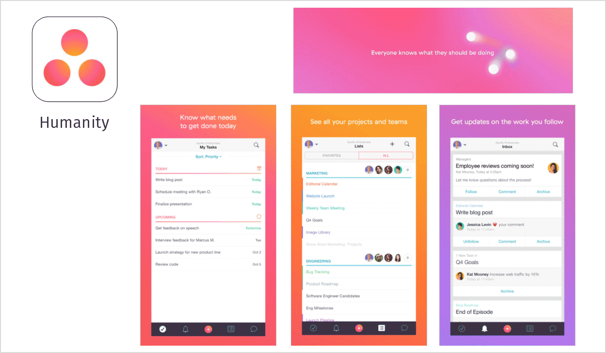
I conducted Visual Competitive Analysis. Sling: Clean but Sterile; Easily forgettable. Humanity: Corporate colors, cluttered, feels like excel.
Then it was time for some out-of-category inspiration. Humanity: they bring their ideals into their design; zen/harmony. Use gradients well. They have a lot of colors, but are constrained in a way that feels minimal, adds to clean and modern design. Slack: Colorful UI is intriguing to use, and different. Utilize contrast well to separate elements. Friendly and approachable brand image.
Design Principles
We developed the design principles with the clients and users goals in mind:

Not mad about ads
The app is monetized, but it shouldn’t feel that way. Ads should not disrupt the user experience and should feel like part of the UI.

It doesn’t feel like work
You use ShedWool for work, but it’s not Microsoft Office. Interacting with the app is pleasant, and invites users to use it more.
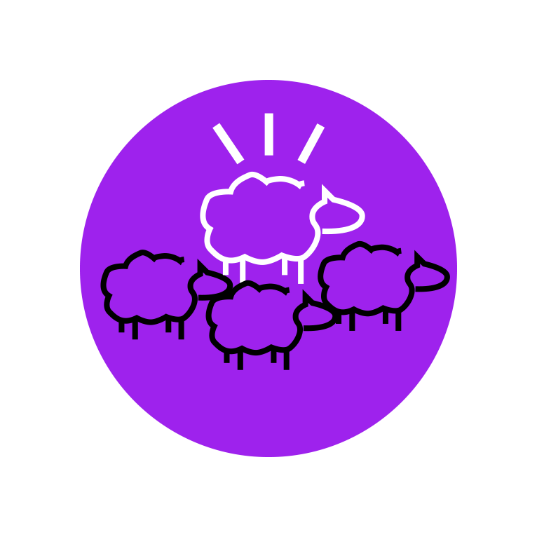
Stand out from the flock
We celebrate color loud and proud. Color conveys meaning, creates hierarchy, and directs the user’s attention and interaction.
Design Direction
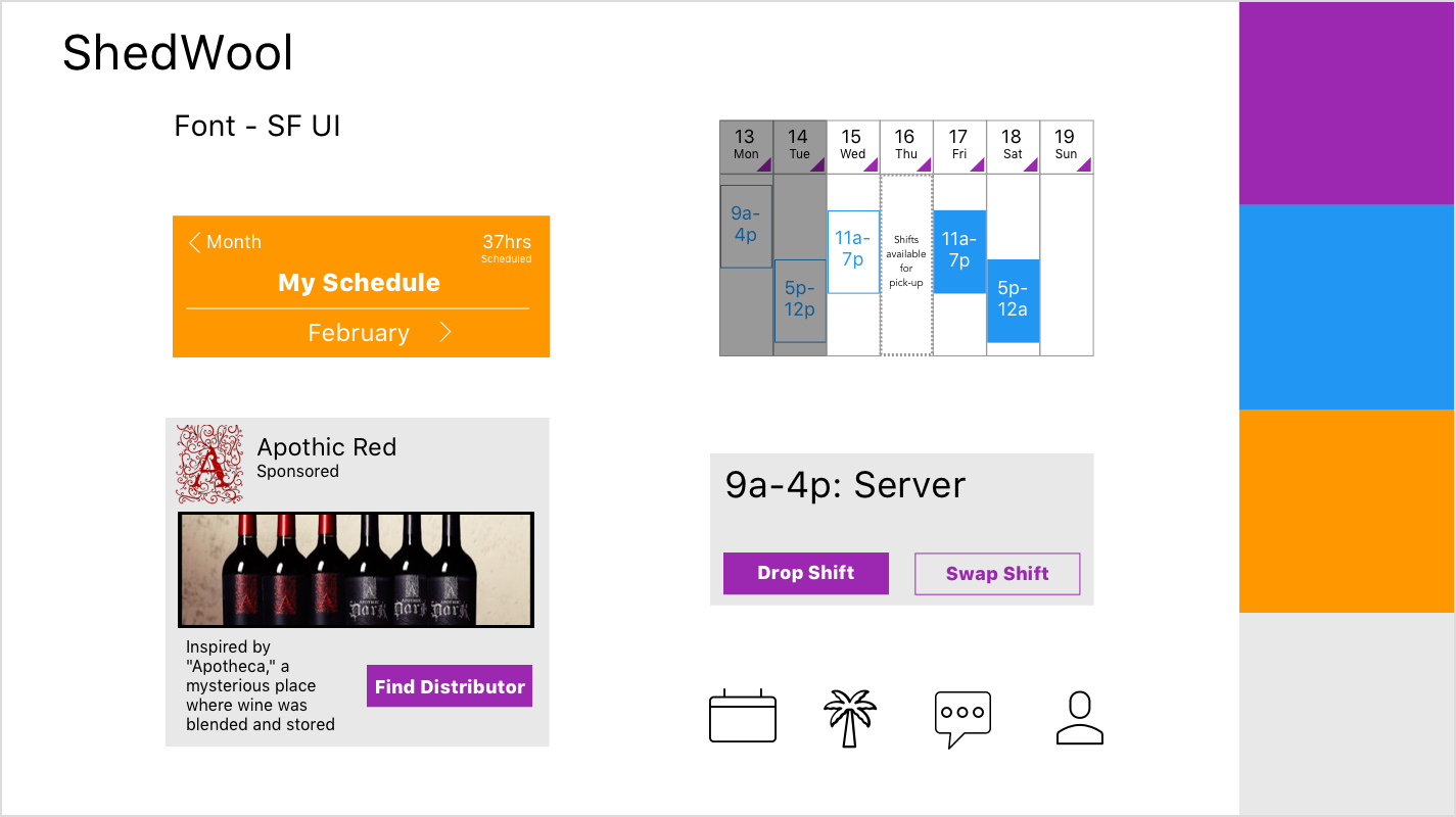
For my first style tile I used more utilitarian iconography, with bright colors.
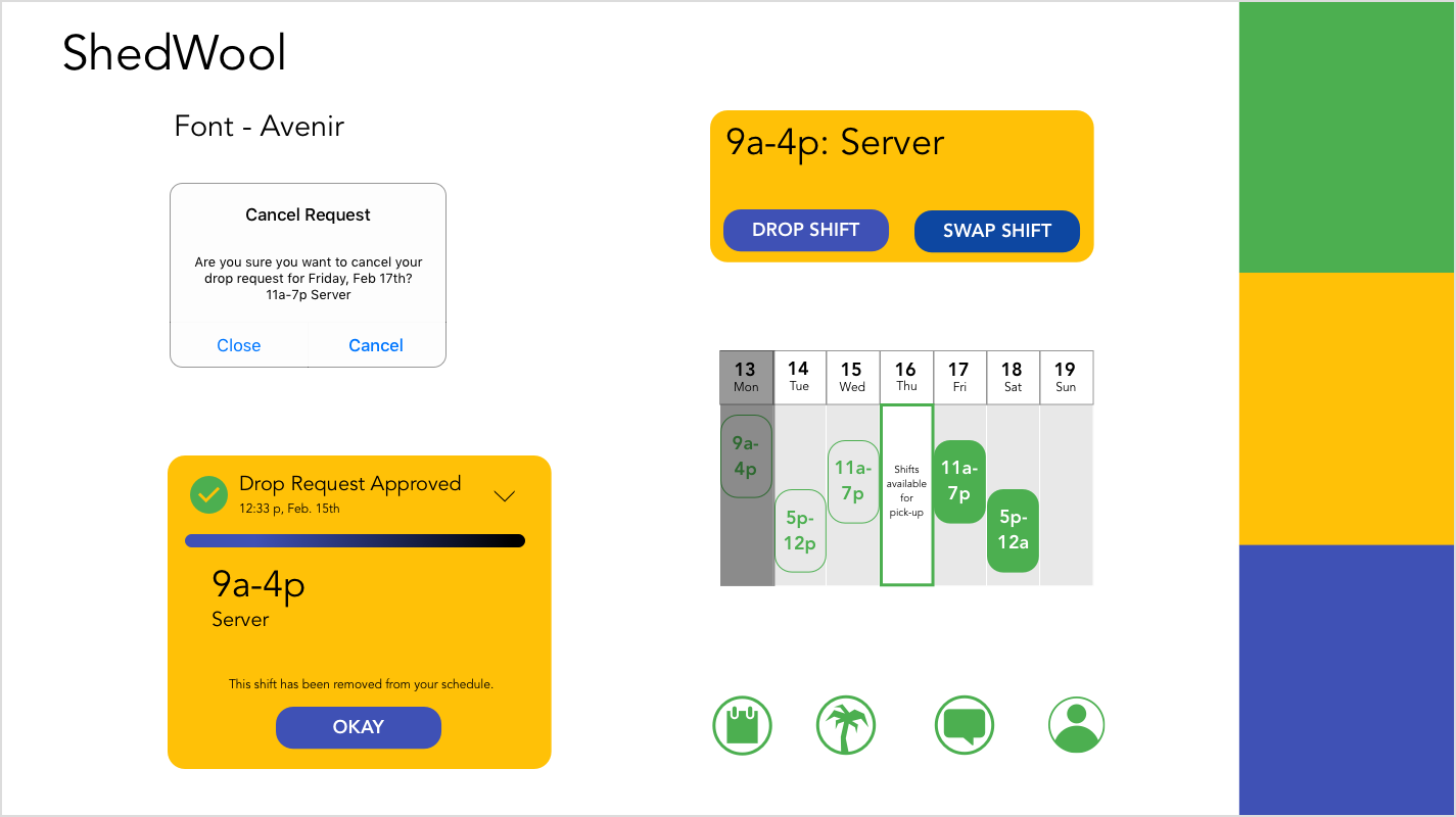
I incorporated a rounded corner theme with cooler color tones for my second style tile.
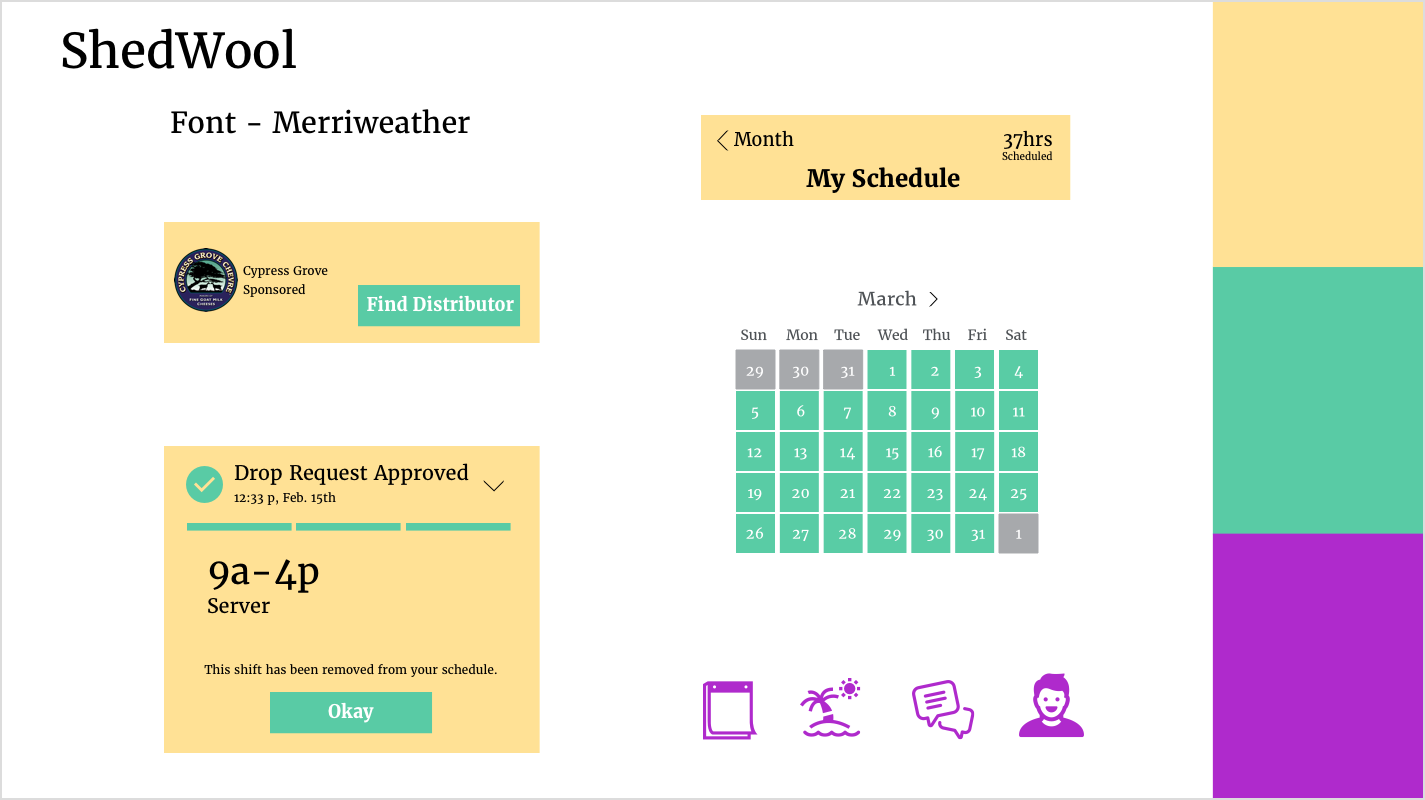
For my third style tile I chose muted colors create a calm tone. Friendly iconography.
I chose the third style tile, because it was the lightest in color. I thought this was important, because there was so much content
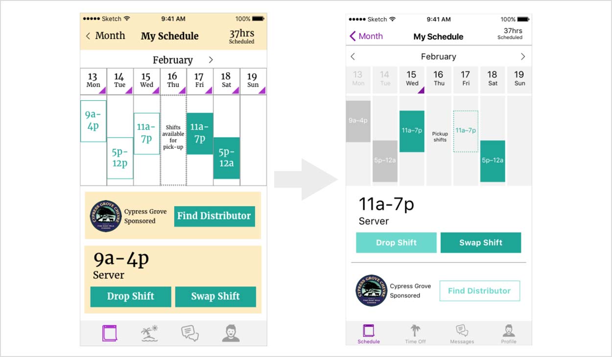
Added triangles to each date as a button that would show who is working that day. Adjusted the order of the tab bar to put it in a logical order. Made the icons a little more fun.
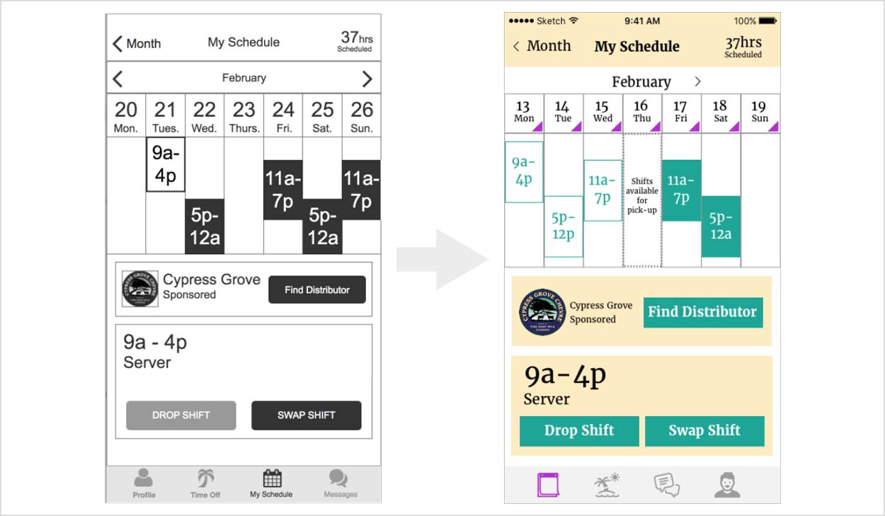
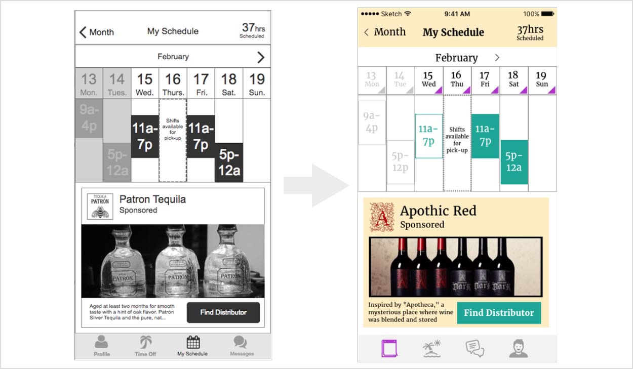
Made the ad size smaller. And made the calendar taller.
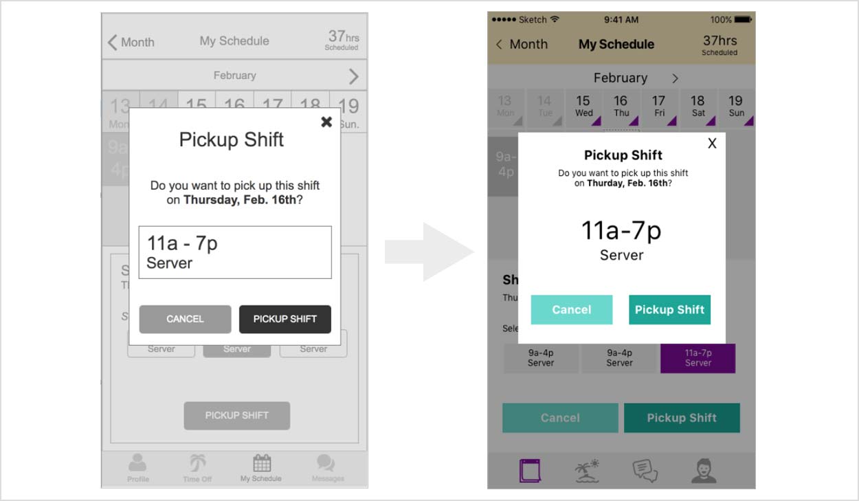
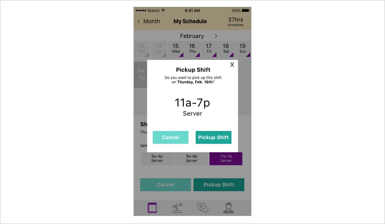
Slightly smaller modal and buttons. More emphasis on the shift.
We conducted 4 user tests. These were done on site as well as virtual via google hangouts.

Same color buttons confused hierarchy and put too much focus on the ad cta.
The clear contrast helped the user know what areas of the screen were actionable with the background darker then the modal.
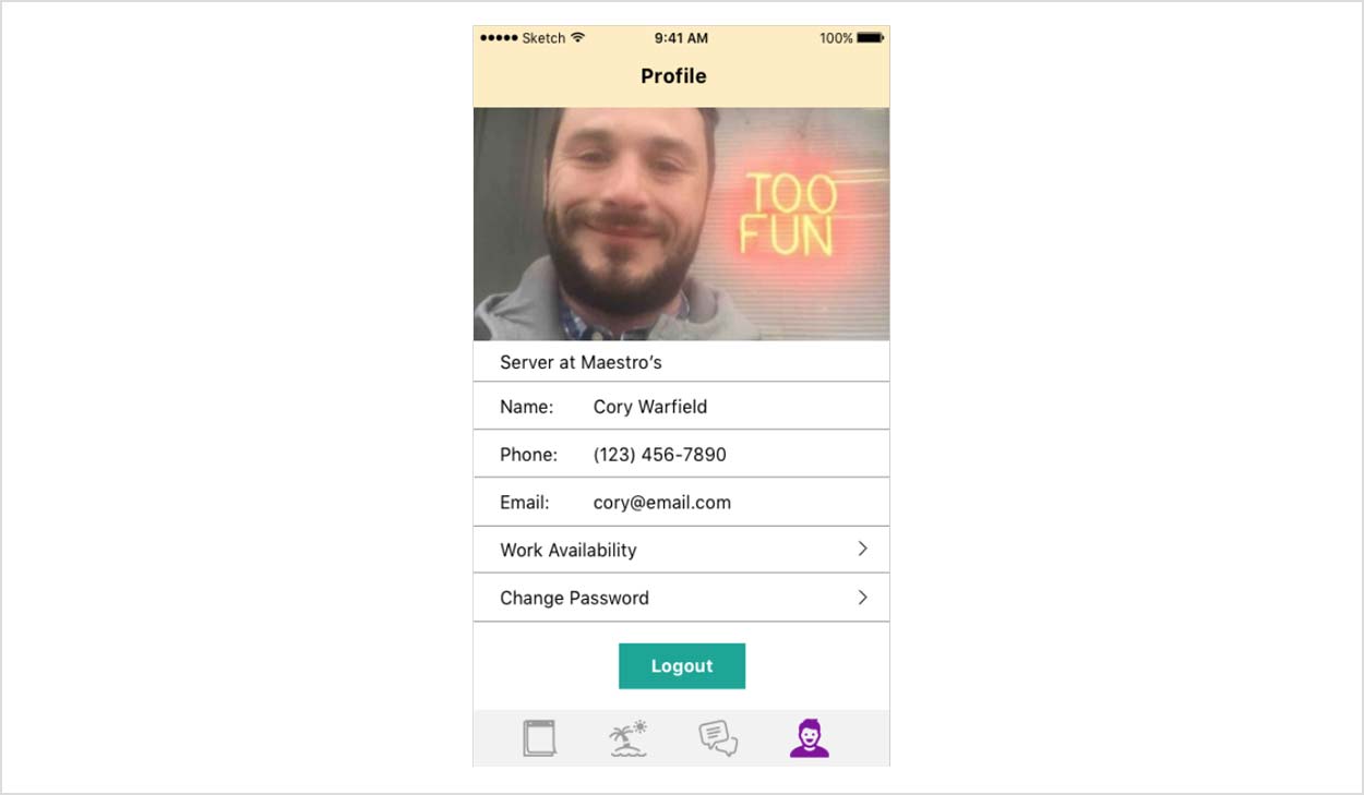
like having the phone number there, since I like to know that I can reach the person if I need to. Not a fan of the creamy yellow, looks like a third wheel to the green and purple.
It was time to pivot. I dropped the yellow, darkened the purple, changed the font from Merriweather to SF, simplified the calendar, moved the ad below the shift and changed the style of cta buttons for easier differentiation, simplified time off and added titles for the icons in the tab bar.
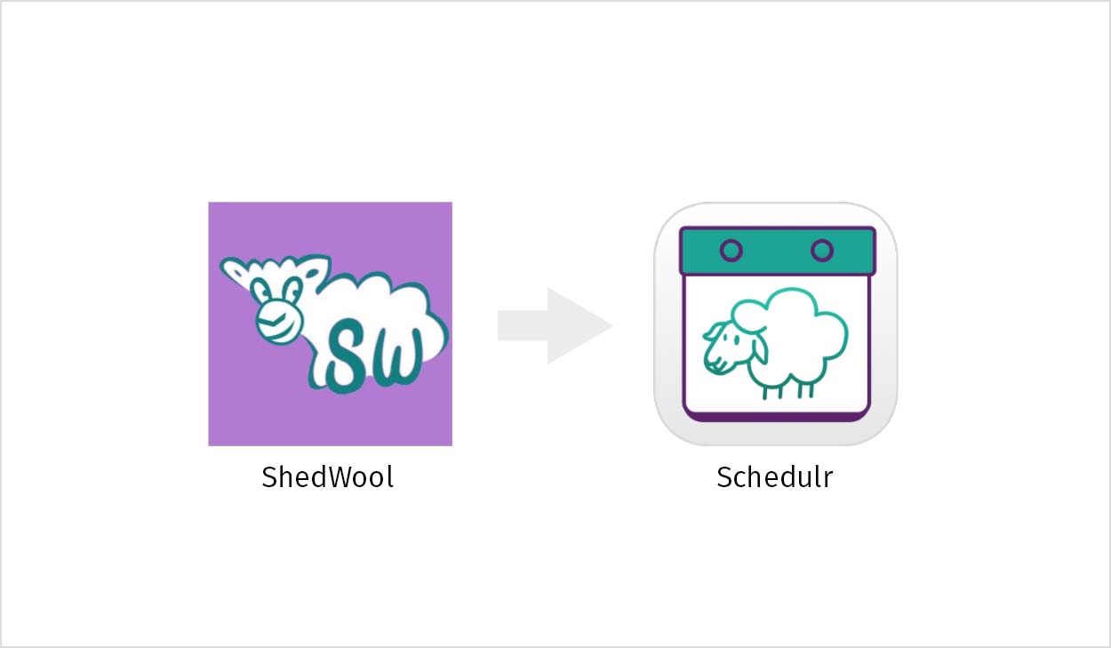
To go above and beyond what was asked of us we took a look at the ShedWool name and logo and offered alternatives since the clients were open minded.
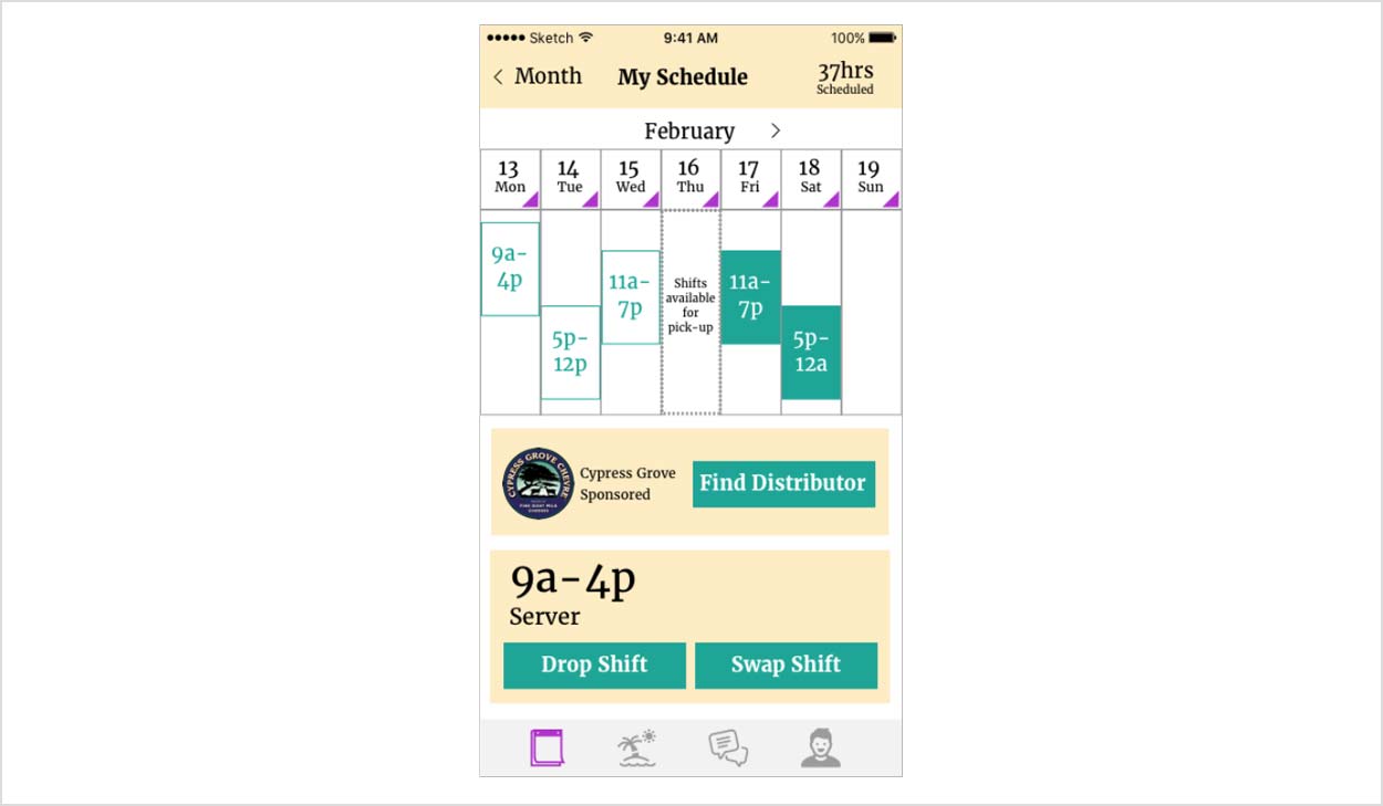
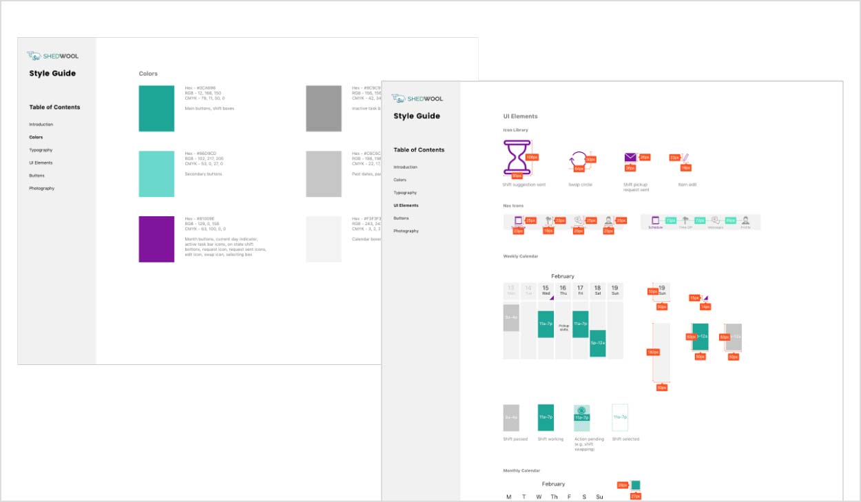
I built a living style guide that described how to use typography, color, UI elements and other specs.
I learned a lot about presenting to clients throughout this project. I learned different techniques to prepare for a presentation, like using notecards. I also learned a little more Proto.io and how to link pages and create animations.
The flow that you'll see in the demo takes you through the following pages: home, conferences, gala, fair and blog.
View demo
Final Thoughts
If I had more time, I would flesh out more flows and play with the calendar to make it even easier to use.