Client: ChiTAG (Chicago Toy and Game)
Role: UI Designer
Deliverables: style tiles, high-fidelity mockups, prototype and style guide
Timetable: 3 weeks
Tools used: Photoshop, Illustrator, Sketch and Proto.io
From the Beginning
ChiTAG was my client. They are North America's largest toy & game fair open to the public. Their event takes place once a year for one week. The prompt was to redesign their website. Not only did the look and feel need to be redesigned, but also some of the functionality, too.
For our kick-off meeting with the client we conducted two activities. Both of these activities were to gauge what our clients liked.The first activity was a gut test. The gut test consisted of screenshots from different sites ranging from super conservative to very playful. The client was given 20 seconds to review each screenshot. The client gravitated towards sites with bright colors and illustrated backgrounds.
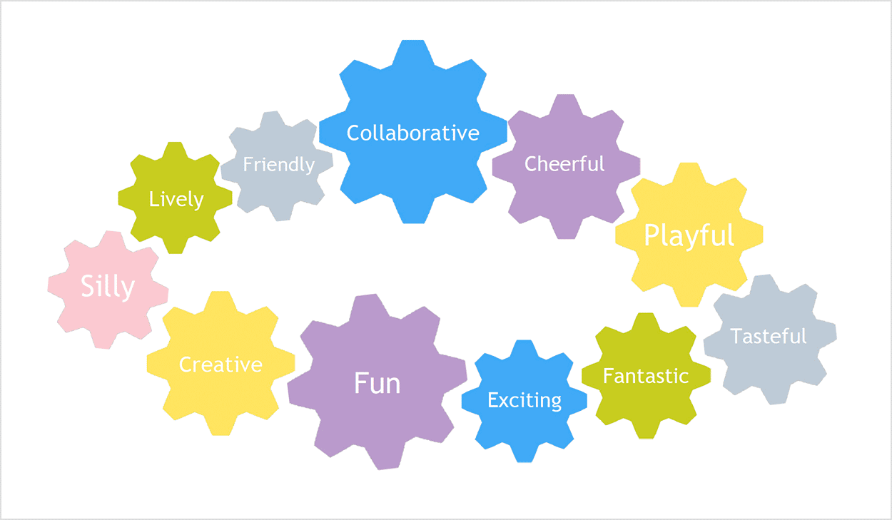
We also facilitated an adjective test asking the clients to select words that they saw the ChiTAG brand becoming. Some of those words chosen were collaborative, cheerful, creative, fun and lively. We also asked them to choose adjectives that did not represent ChiTAG. And those were serious, classic, sophisticated, quaint and dry
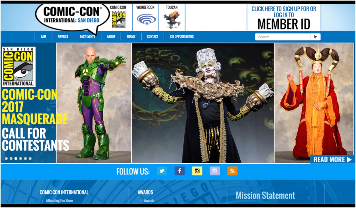
We did visual competitive analysis, for the in category competition we chose Comic-Con International because it’s also a convention. They used bright colors in a meaningful way that helped organize the information. Comic-Con also used a carousel which helped display a lot of content in a user friendly way.
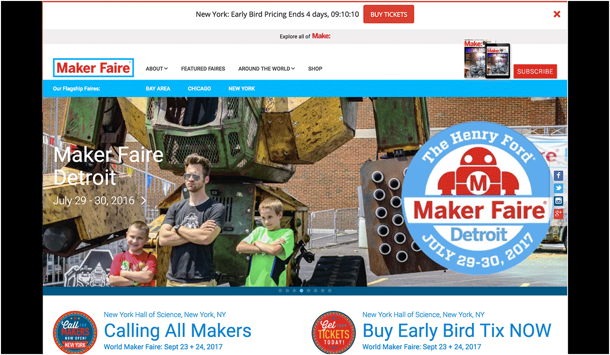
Another competitor was Maker Faire, they have a scrolling Tweet wall with pop up Tweet modals that are very disruptive as you are reading the Tweet wall.
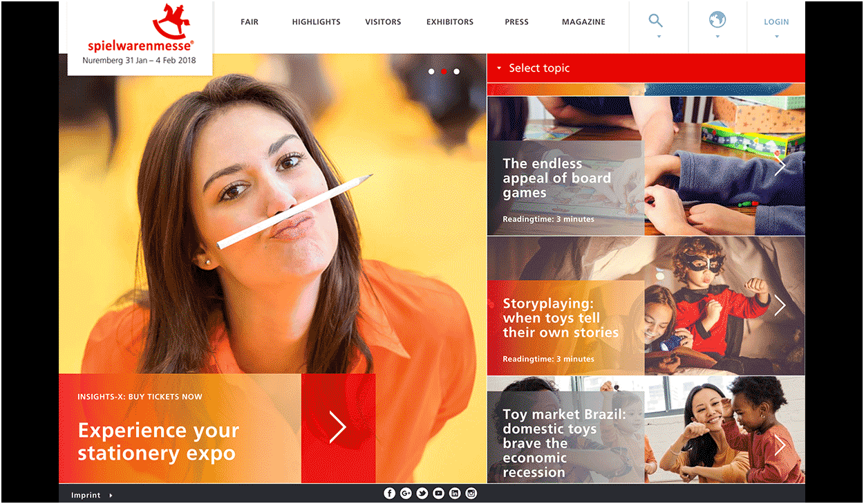
And the last competitor was Nuremberg Toy Fair. When you mouse over the Nuremberg Toy Fair navigation a large obtrusive white box appears behind the drop down navigation. This is very unsightly, because it masks out a good portion of the top of the page.
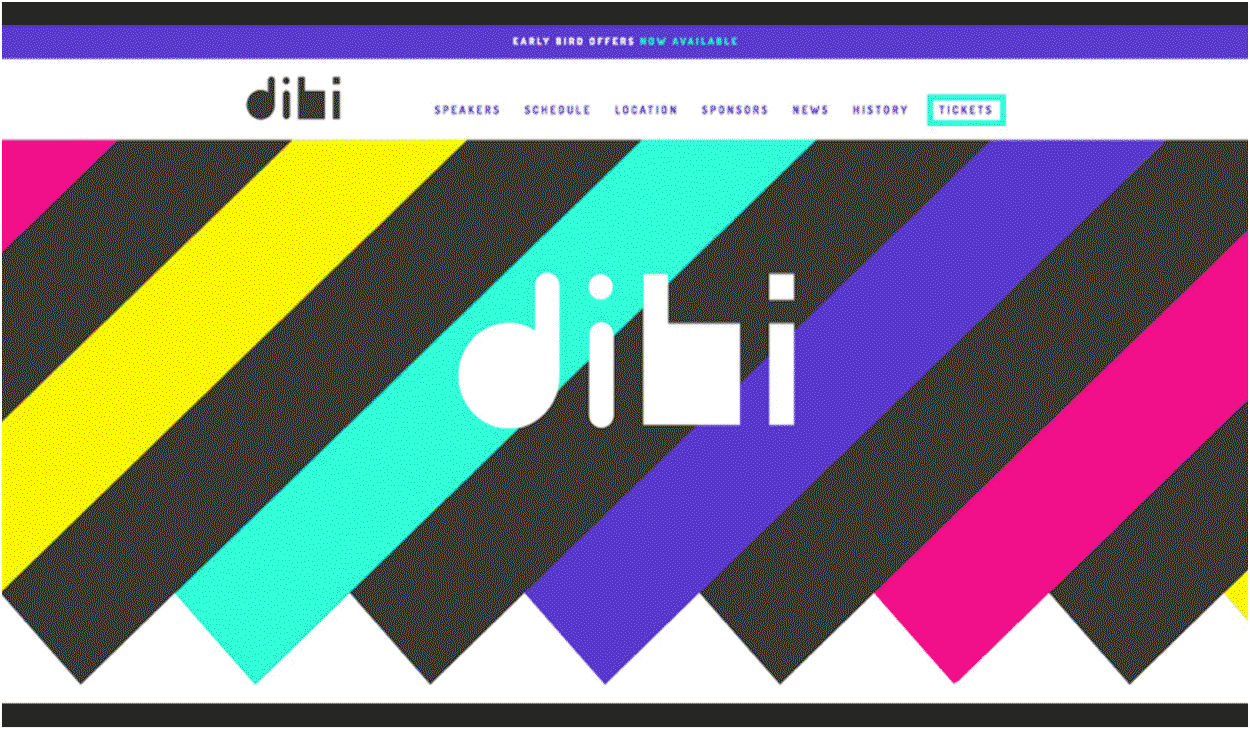
The out of category inspiration we looked at were Dibi, Modern Farmer and PBS Parents. For PBS Parents, this is another good example of lots of color done right. The color creates hierarchy and divides up the content in a way that makes sense.
Design Principles
We got one of our design principles straight from our client. In our kick off meeting she said the site should be FUNctional. She explained how the site should exude fun but should also be serious for the inventors who are part of Chicago Toy and Game Week Here is what we landed on:

FUNctional
Visual design makes the user’s experience from point A to B fun. Whether it’s to purchase a ticket or sign up to a vendor - fun frames the experience.

Digestible
Maintain user attention by keeping information organized, succinct, and relevant. Users are presented with blocks of information, and can easily choose which ones they’d like to continue with.
Accommodating
Overall ecosystem of the website is cohesive. Current content can exist in the website, and new content can be introduced later, all content lives harmoniously with the ChiTAG brand.
Design Direction
For my first style tile I went with rounded corners and bright colors. I thought that it most closely matched the existing site. My intention would have been to use the colors sparingly as not to clash with each other.
For my second style tile I went with a dark UI because the client said if dark UI works it works right. I also used a cool color palette of blue, green, grey and black. I wanted to make a sleek style tile by using a dark grey background and black content boxes.
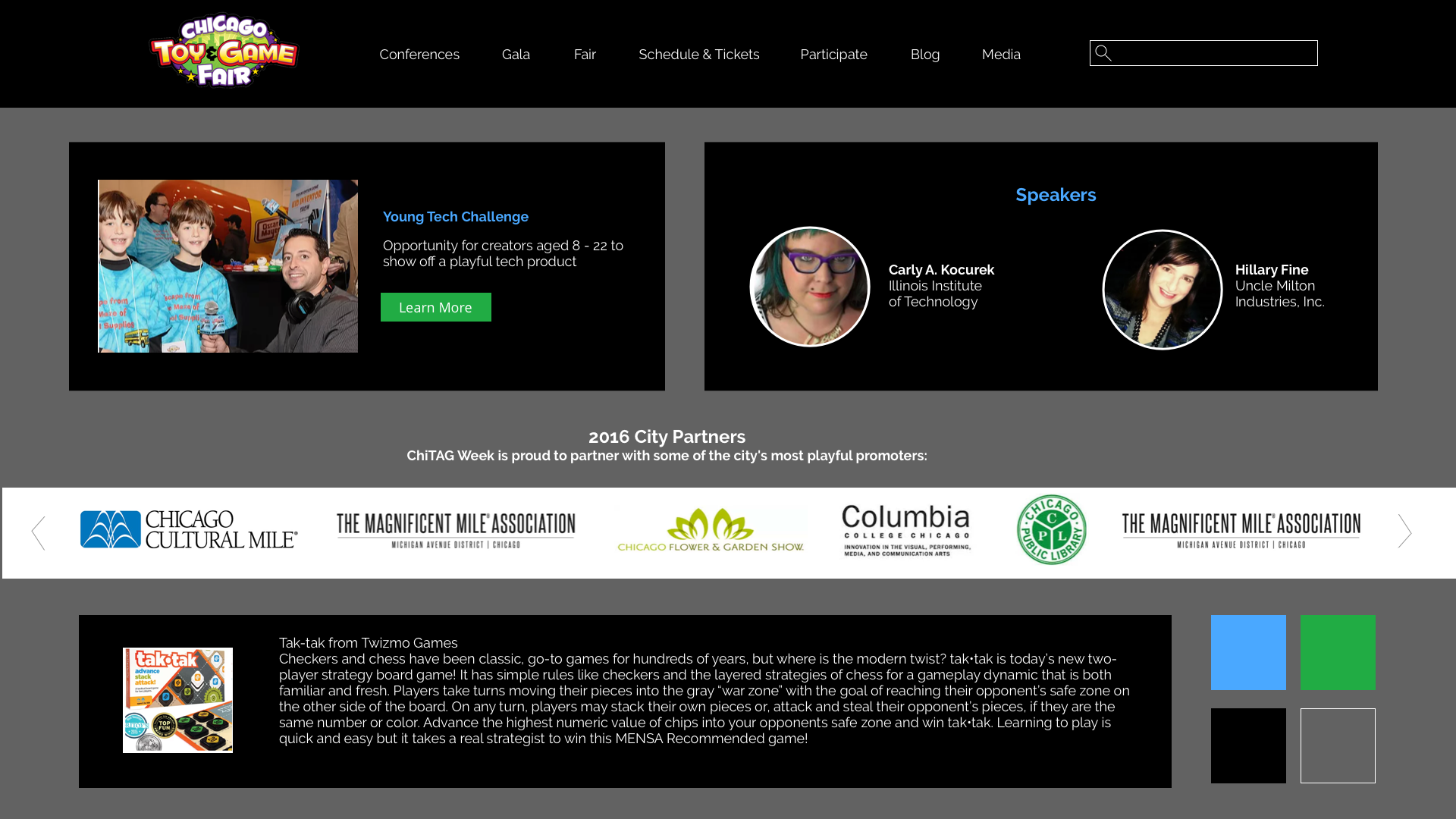
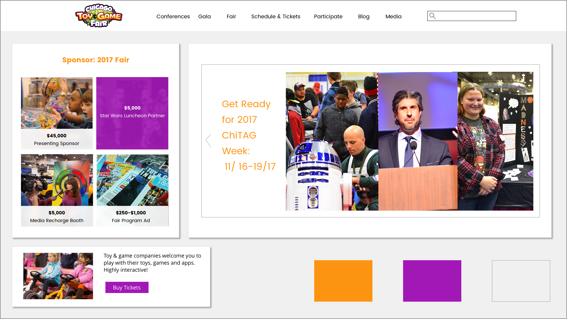
For my third style tile I did go with some bright colors but a muted grey background. All the cards have a white background. There is a slight contrast but not too jarring. The purple and orange were pulled from the clients existing color palette. The client was pretty adamant about retaining their existing brand colors.
I chose the third style tile, because it was the lightest in color. I thought this was important, because there was so much content
With no wireframes or any other UX artifacts, we planned out the flows to help us understand the site better.
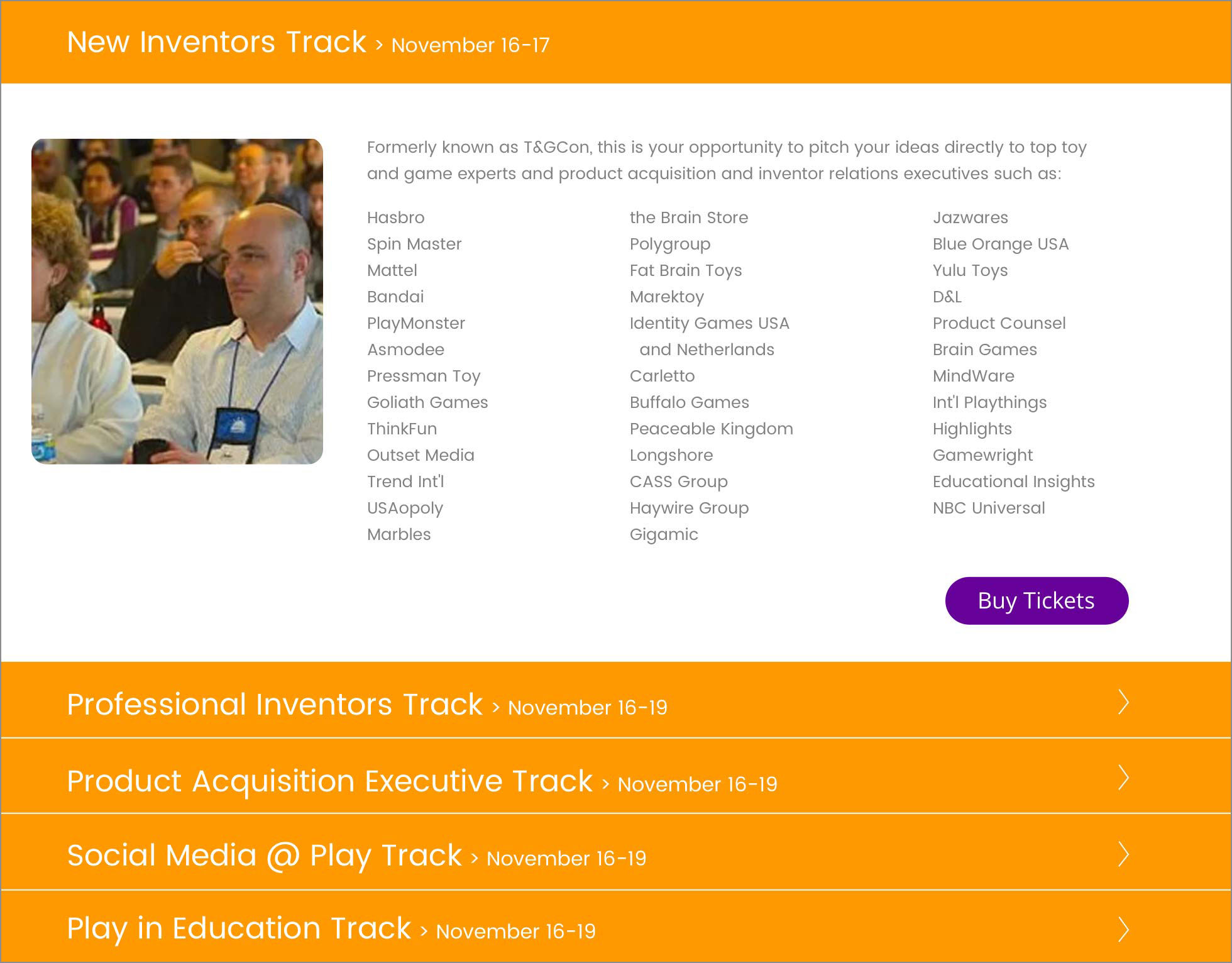
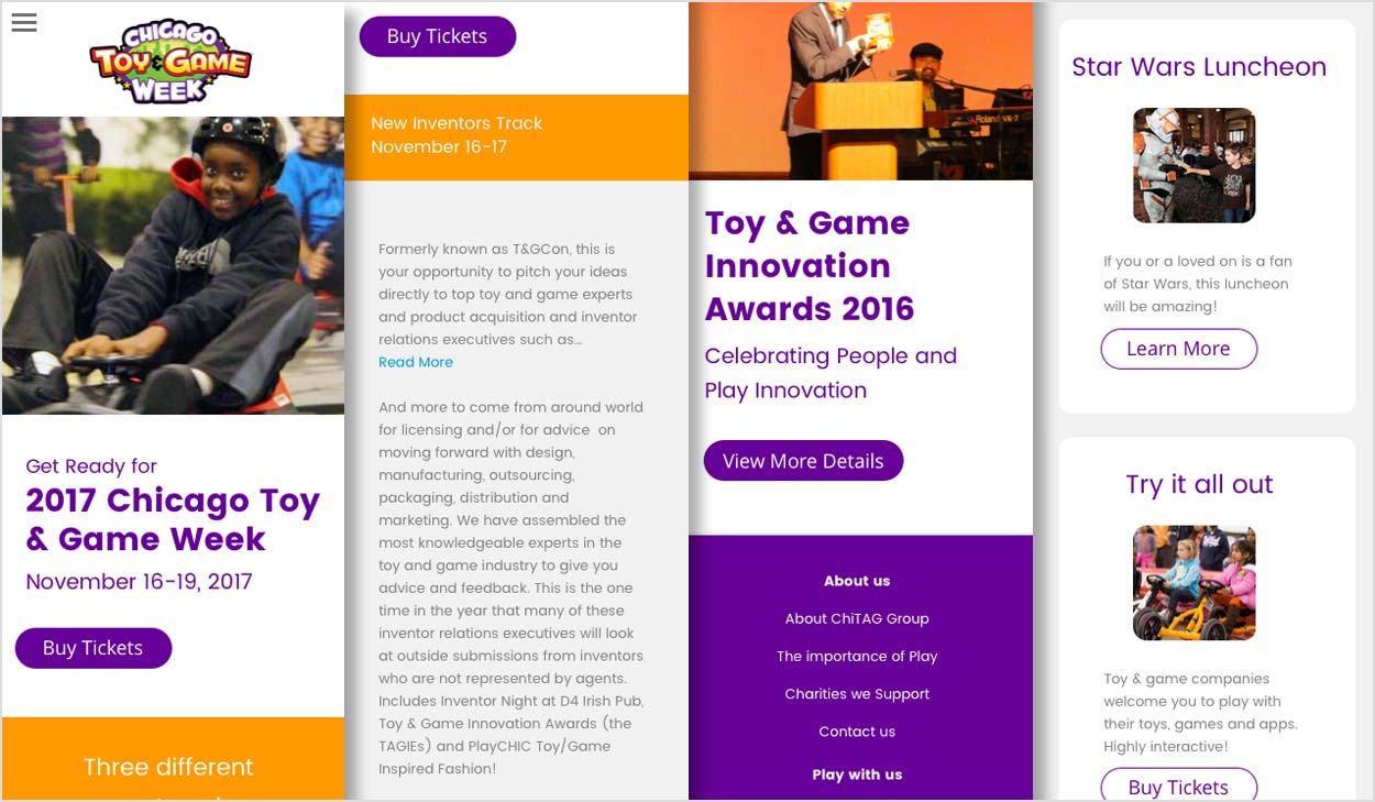
I kept the menu items on top with the logo against white to make them stand out on the page. I created the initial design. I added a carousel to hold a lot of content. I used orange for the titles because they complimented the purple buttons I used.
I chose to use cards with white backgrounds against a grey background to create a clean look to the site. Poppins was the font I used, because it looked good and was readable in headline and body copy.
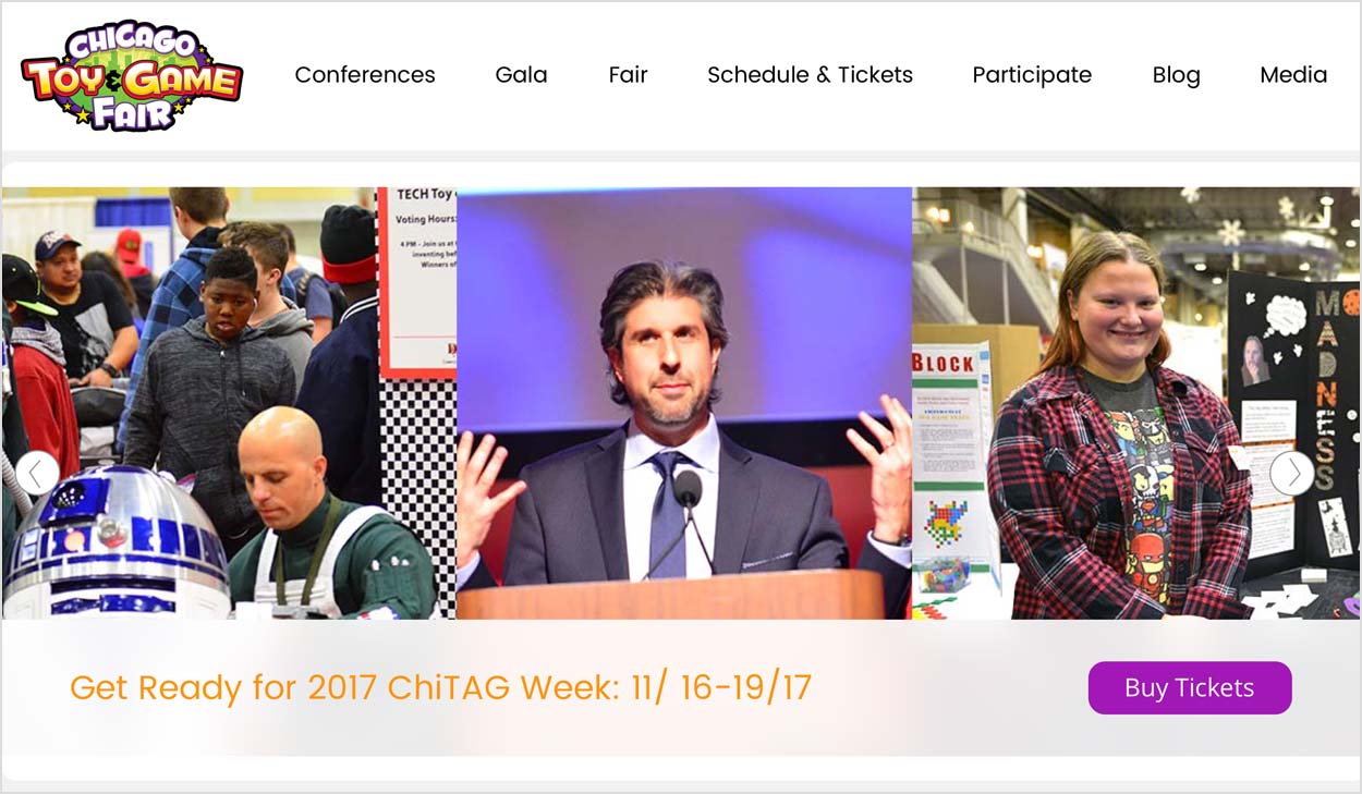
After sharing my designs with the team in an internal review, the team suggested that I not have 3 combined images for the hero image. The consensus was that it looked too busy and took away from the call to action button.
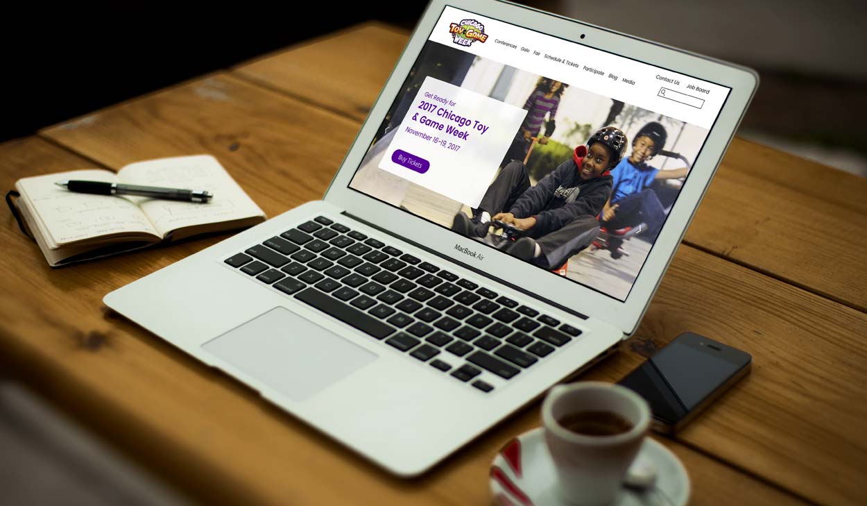
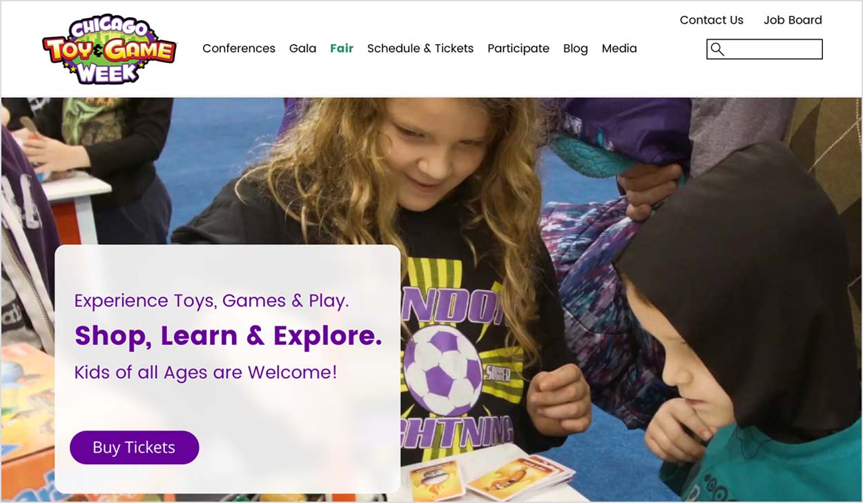
What I changed the hero image to be was a kid riding a go cart with a card overlay that contained the headline and subhead. I chose the image because of it’s positive energy.

We conducted our 1st round of user tests and my new hero image was well received. The first test user said “that young boy’s face is full of wonder and screams fun!”
One of the test users said my site didn’t look like a toy and game site. The test user said it was because of the sparse use of color.
Another test user thought there should be an explanation of what ChiTAG is toward the top of the page.
To accommodate the feedback, I added photos and titles showing what was going on at the event. The client provided a library of imagery from the event. That made it easy to choose some great shots.
Per a suggestion from my Creative Director I rounded the corners of the cards.
When it came time to present the creative to the client, I made sure I practiced a lot with my team so that I would come off very polished. After I was done presenting my creative to the client, the client liked where my creative was going. The only feedback was that the grey was too dark in the background and that the site design needed more fun elements in it.
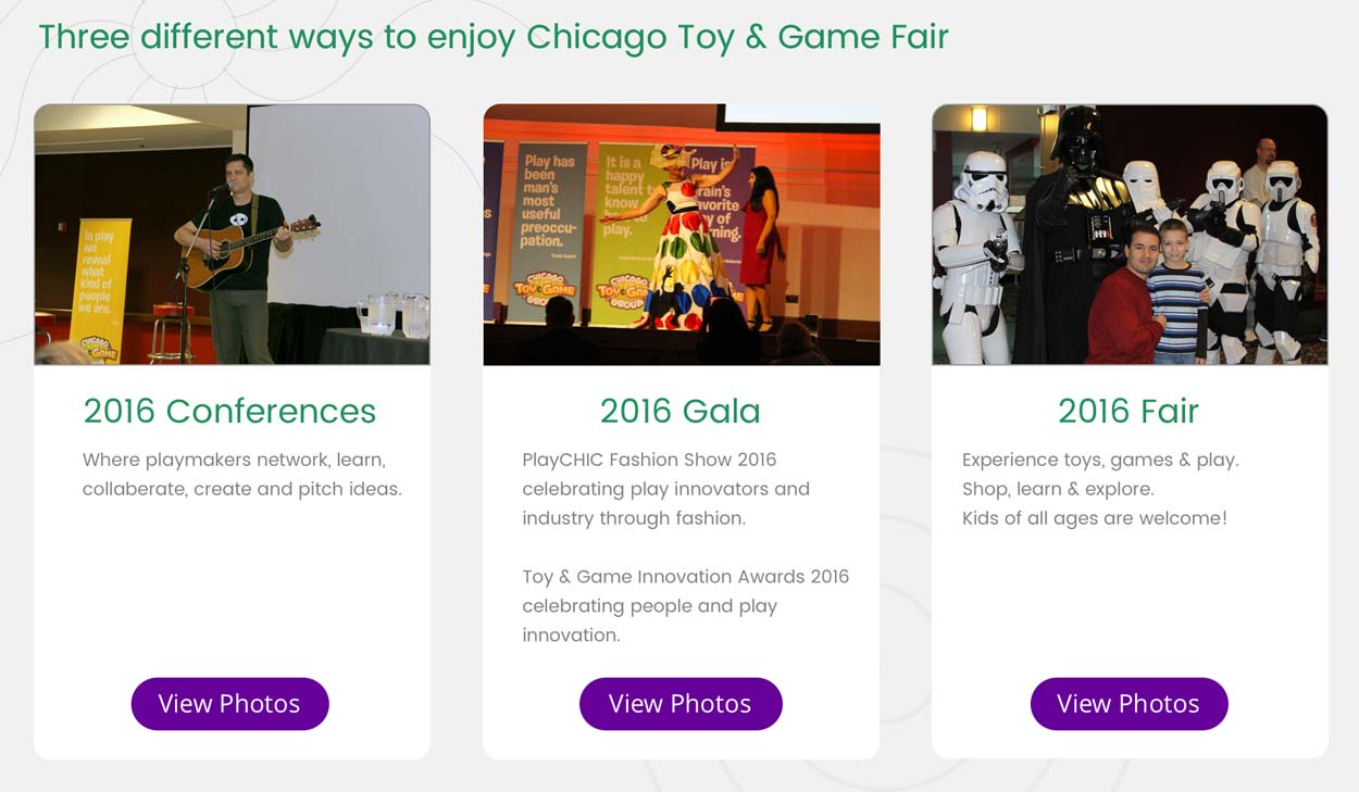
So I lightened up the background grey and I added shapes to the background to add fun and interest to the page. My favorite was the spiral because it looked whimsical. I also broke out the Conference, Gala and Fair into 3 rectangles including image with title and button. After seeing it in layout I felt that the user would have to scroll too much to see each of them. Therefore, I reduced the size of the rectangles so that all 3 fit across the page.
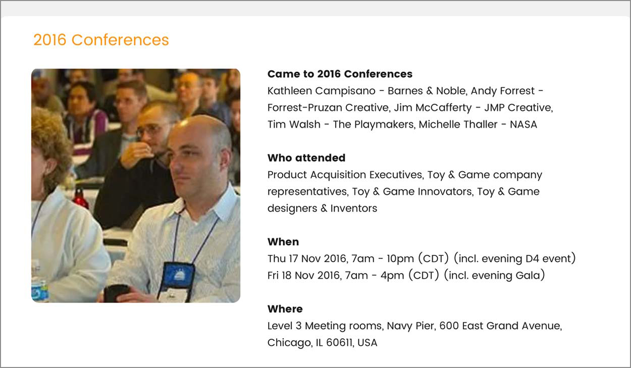
On the conference page I chose to use an accordion to show and hide a lot of content. This gives the user easy access to content by opening and closing tabs.
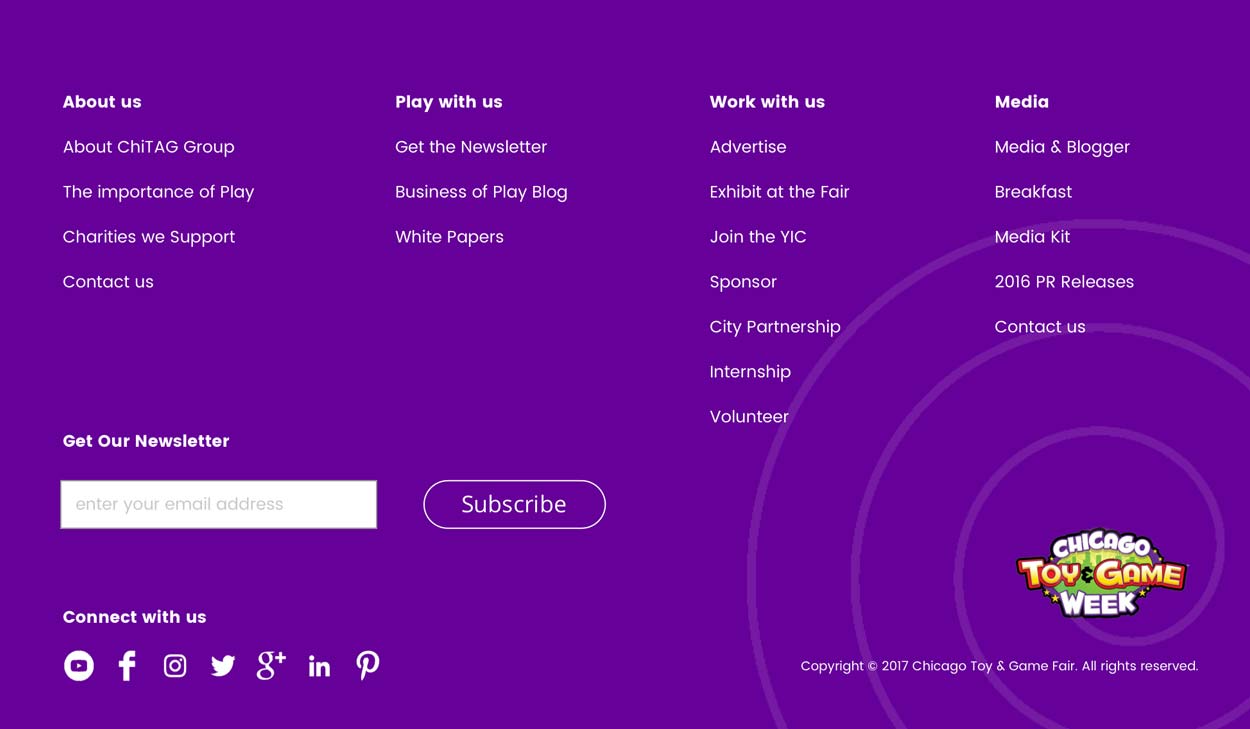
After making some of these changes it was time for another round of user tests. One of the big takeaways was that the footer with orange background made it hard to read the text and that there were too many buttons on the site.
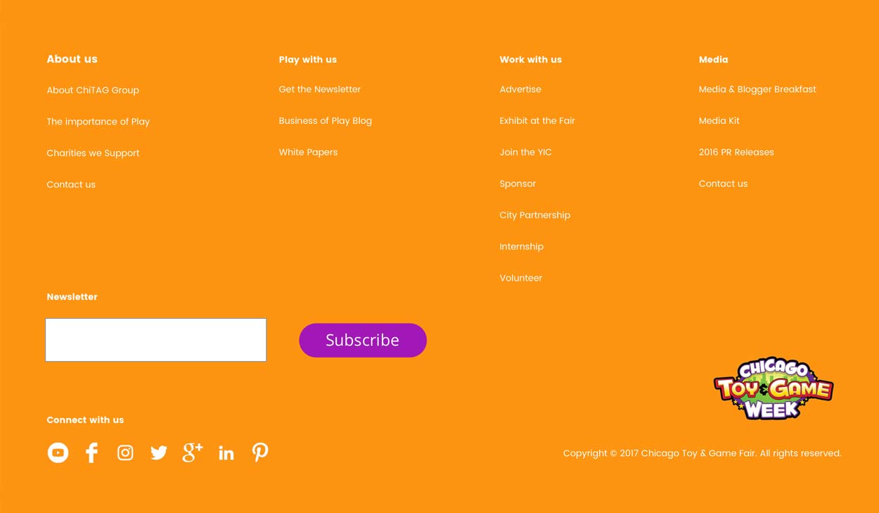
My fix for the footer was to use a purple background.
I made some of the buttons outlined and not filled to indicate that they were secondary.
I made some of the buttons outlined and not filled to indicate that they were secondary.
I learned a lot about presenting to clients throughout this project. I learned different techniques to prepare for a presentation, like using notecards. I also learned a little more Proto.io and how to link pages and create animations.
The flow that you'll see in the demo takes you through the following pages: home, conferences, gala, fair and blog.
View demo
Final Thoughts
If I had more time, I would iterate on the design and remove some elements from the site. I would change some of the buttons to link buttons, like Learn more. I think this would make the site more impactful.