Client: DESIGNATION
Role: UI Designer
Deliverables: style tiles, logo, high-fidelity mockups, prototype, UI Kit and style guide
Timetable: 4 weeks
Tools used: Photoshop, Illustrator, Sketch and InVision
Getting Started
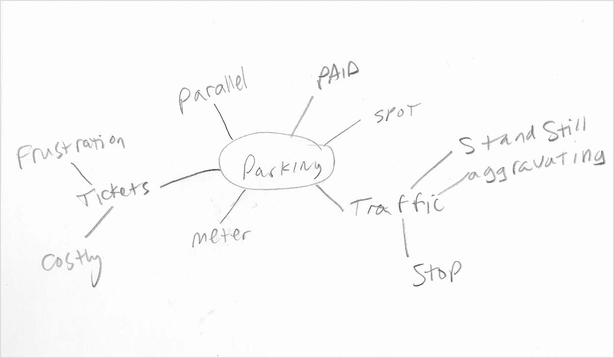
As I received this brief and reviewed it, I knew this was going to be an awesome mock project. The project Can I Park Here, was an app that helps users find legal parking in Chicago. The client was DESIGNATION, who previously had a UX team design a solution for the confusing problem that is parking in Chicago.
While we were interpreting the UX research, we conducted visual competitive analysis. The criteria we used for comparing companies was color usage, features and UI design. The direct competitors were Spot Hero, Meter Beaters, Parche and ParqEx. What made these direct competitors were overall function of the app. They also included features closely mirroring our app.
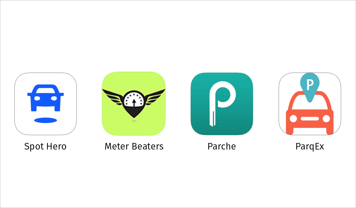
One thing I adopted to my design from Meter Beaters is the colored lines indicating places to park.
The out-of-category inspiration was Google Maps, Lyft and Waze. These all demonstrated good UI and UX, because it was easy to use these apps.
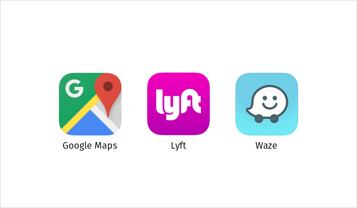
I continued further by exploring Waze as an out-of-category inspiration for the fact that the buttons were at an easy to reach distance from your thumb.
Design Principles
Next we tackled defining the design principles. Design principles exist to help guide the design process to keep it on track We struggled at first. The first iterations were more functions and characteristics that every app should have. And what we learned was that the design principles should be app specific. Here are our design principles:
Make it fast
Build confidence through design by making Chicago parking information in as little clicks as possible.
Color has meaning
Colors are used to direct the user towards action. Users have a clear idea of what comes next in their experience.
Don’t worry, be confident
Keep it casual and nix the legal jargon. Through a familiar tone of voice, users gain confidence to park properly without hesitation and anxiety.
Design Direction
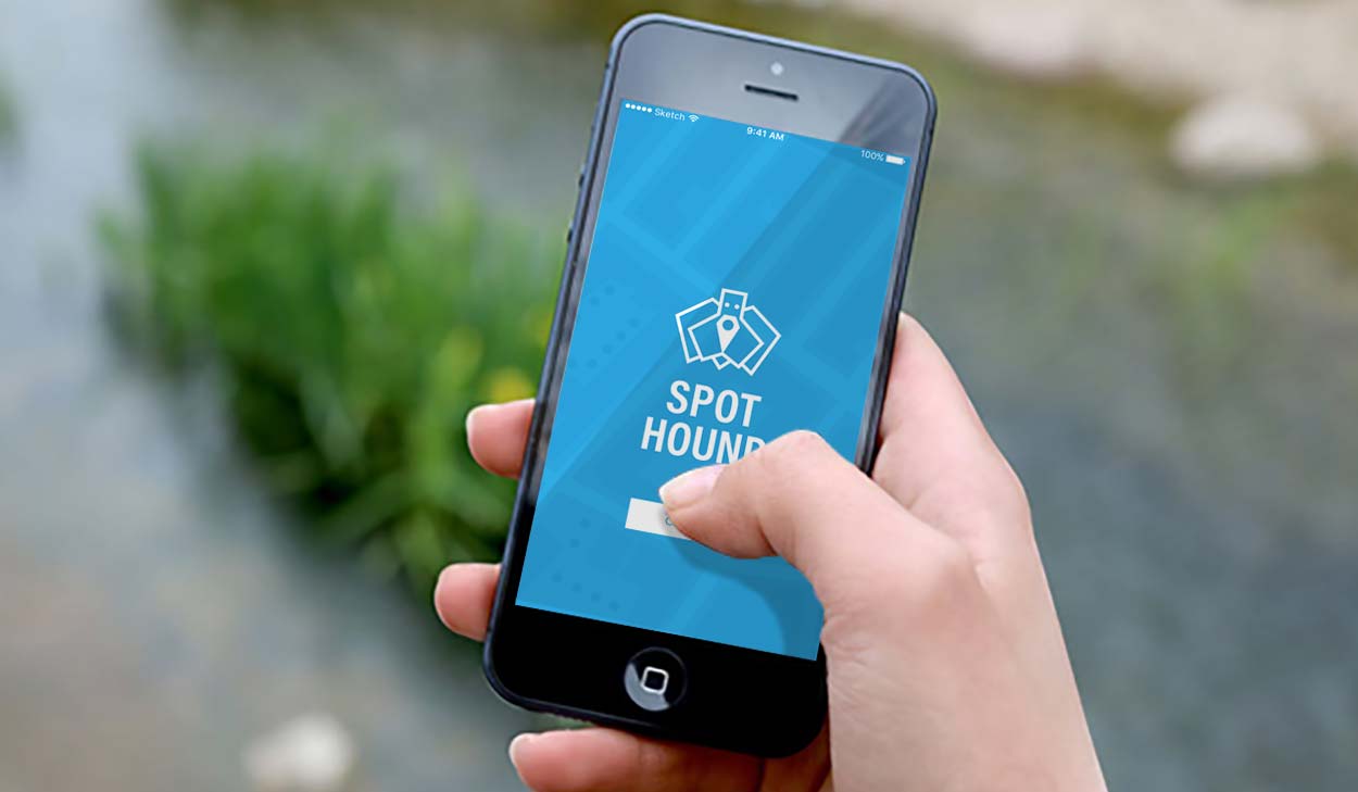
Before getting too far, we felt the name Can I Park Here wasn’t the best name for the app. So we did a word/mind mapping exercise to generate new name options. A handful of suggested names were Park Shark, Park Pal, Secure Spot and Spot Hound. We tested these names with a focus group of potential users. Spot Hound resonated with the majority of the focus group, because it was catchy and easy to remember. The name came from the idea of a hound sniffs out prey and we saw this app as a way to sniff out a good parking spot.
I worked on several logo options.
I opted for a friendly origami hound logo with a drop pin for a nose.
My next step was to create moodboards. When making my moodboards I incorporated Chicago colors and imagery, because this was made specifically for the city of Chicago. Chicago’s confusing parking signs is why this app is for Chicago.
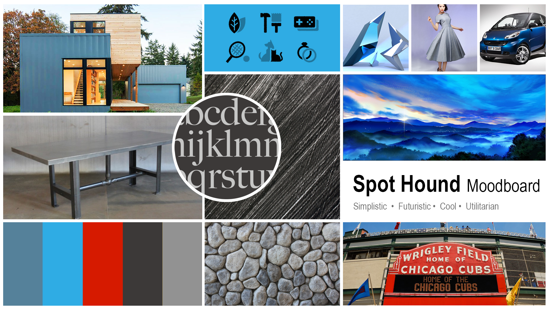
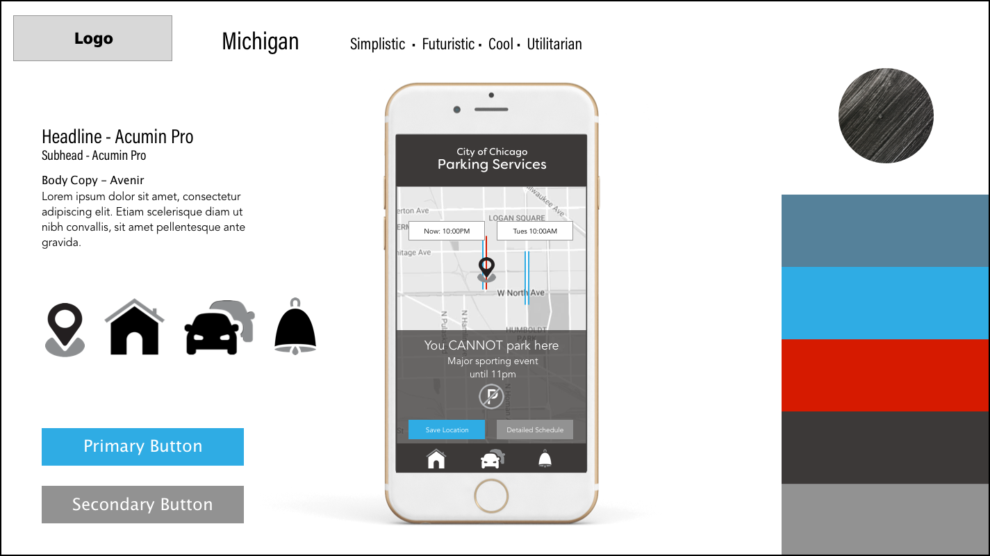
Simplistic, futuristic, cool
and utilitarian.
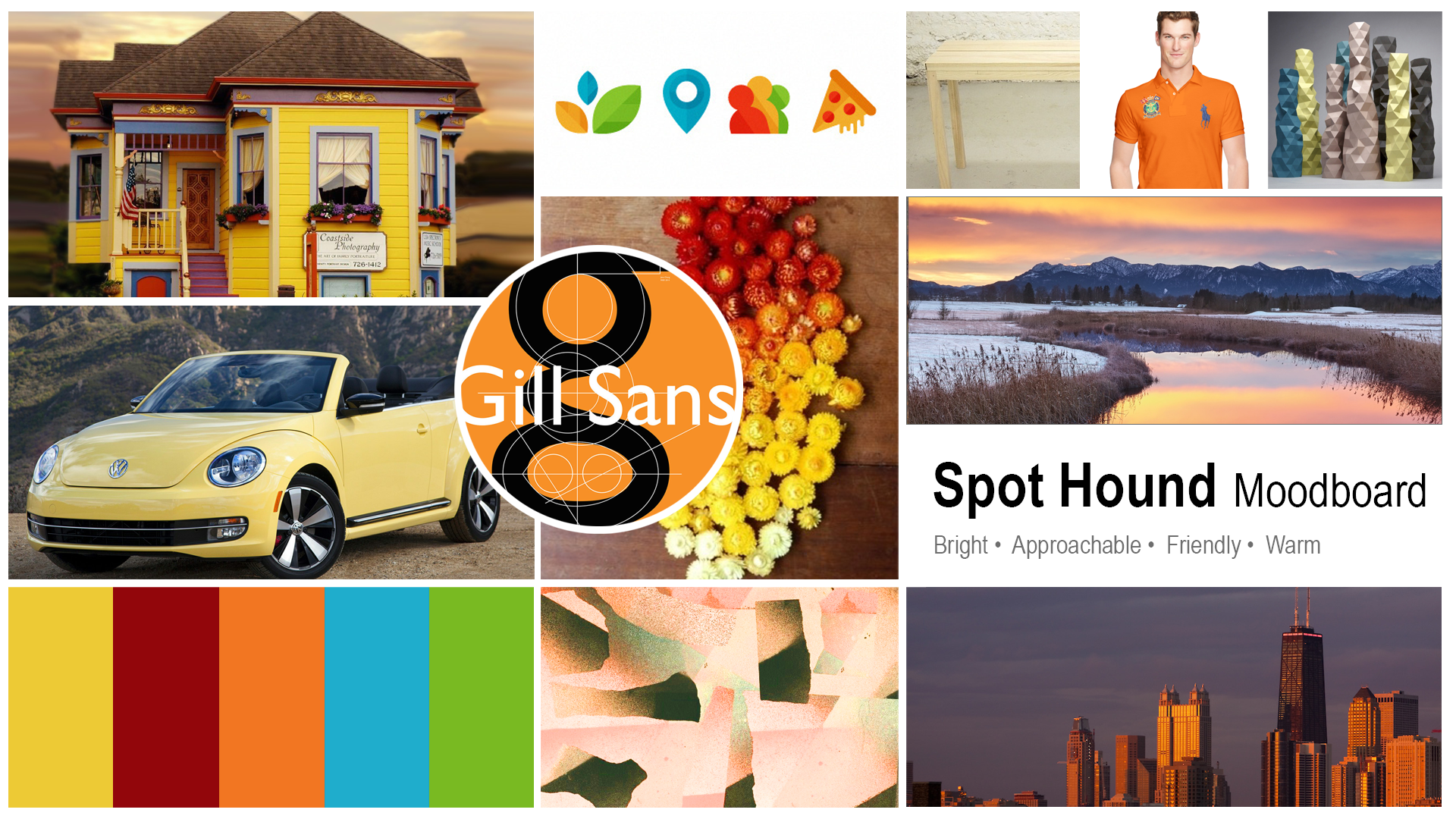
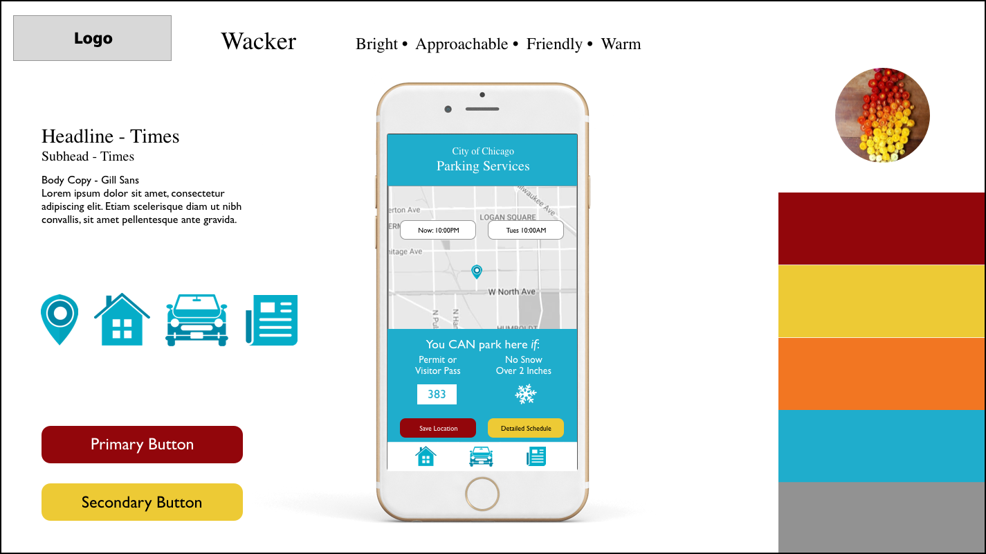
Bright, approachable, friendly
and fun.
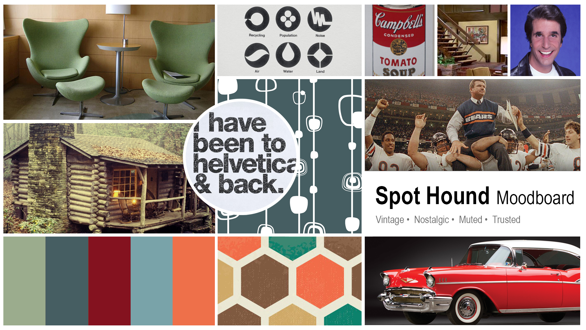
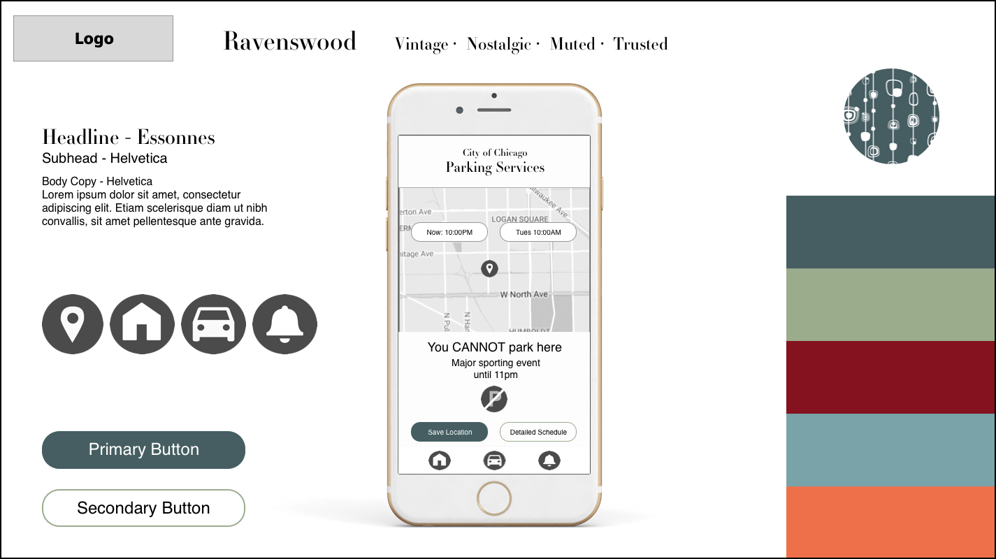
Vintage, nostalgic, muted
and trusted.
When building my 3 style tiles I wanted them to be divergent to offer distinct design directions. For the Michigan style tile I used simple solid iconography and utilitarian, dark UI. The font Avenir is modern. I chose blue as the dominant color because it’s a calming color. With all the road rage out there we can all use a little more calm. I went this direction, because the user wants to get in and out of the app as quick as possible. The quicker the user can accomplish their goal the more successful the design.
With the Ravenswood style tile, uses a light UI with clean iconography. The typography was classic, using Helvetica and Essonnes. I created UI that used bold shapes. There is enough contrast so that the UI guides the user.
Finally, the Wacker style tile was a complete 180 degree turn from the other two. Bright and loud, the detailed iconography and use of primary colors made this style tile stand out.
I decided to go with the Michigan style tile because of the cool colors and contrasting UI.
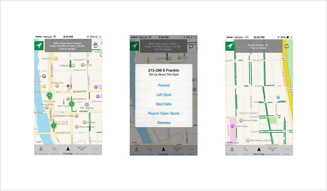
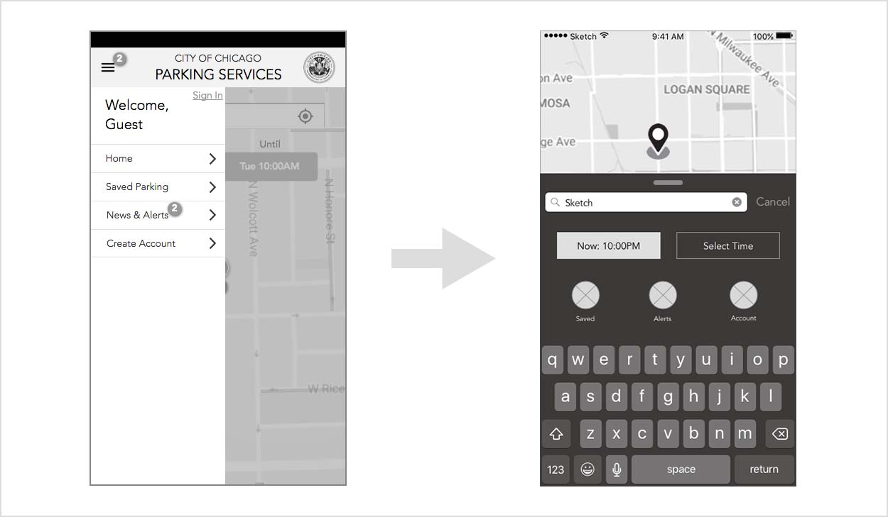
My team and I reviewed the UX teams wireframes and were getting hung up on the fact that it didn’t look like an app. Part of the reason was that instead of a task bar, there was a hamburger menu. We met with the UX team to find answers to our questions and become oriented to their solution. We asked them why the search bar was at the top instead of the bottom. Also, we asked them about the reason for having the schedule toggle between 24hrs and the week. The most important takeaway was that the wire frames they built were for a responsive website. Since we were assigned to create an app; this changed the parameters quite a bit.
We decided the hamburger menu didn’t make sense anymore. Instead of a task bar we decided it made more sense to include menu items in a pop-up modal with a search field. We made both of these changes because we knew it would be more important to users to see more of the map. This is because it is design pattern used by other apps. Seeing more of the map was also a trend with competitors. The main benefit of the pop-up modal was to give users quicker access to the most needed features.
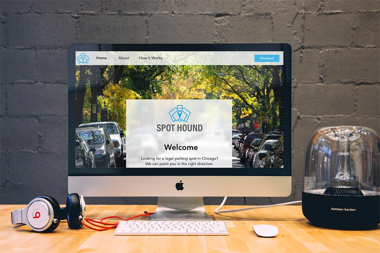
As I built my high fidelity screens my intention was to create a dark UI. A dark UI would make the map and iconography stand out, because the map and iconography are light. When I presented my designs to my Creative Director, she pointed out to me an inconsistency. Even though a good part of the screens had dark UI, the map was light. This made the app look less cohesive.
I chose to do a 180 degree turn and implemented a light UI, because it gave the UI contrast and easier readability. I was happy with the result of seeing my app look bright and refreshing. I used semi-translucent modals to create a clean look and feel to the app.
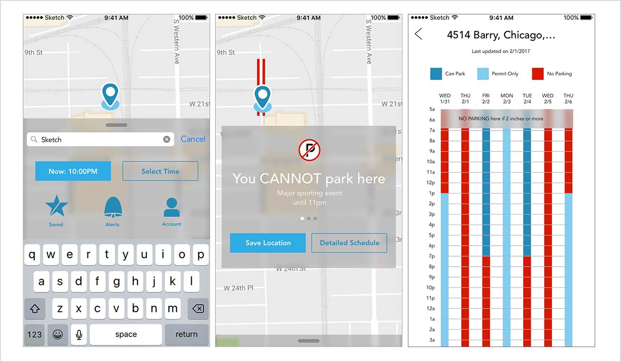
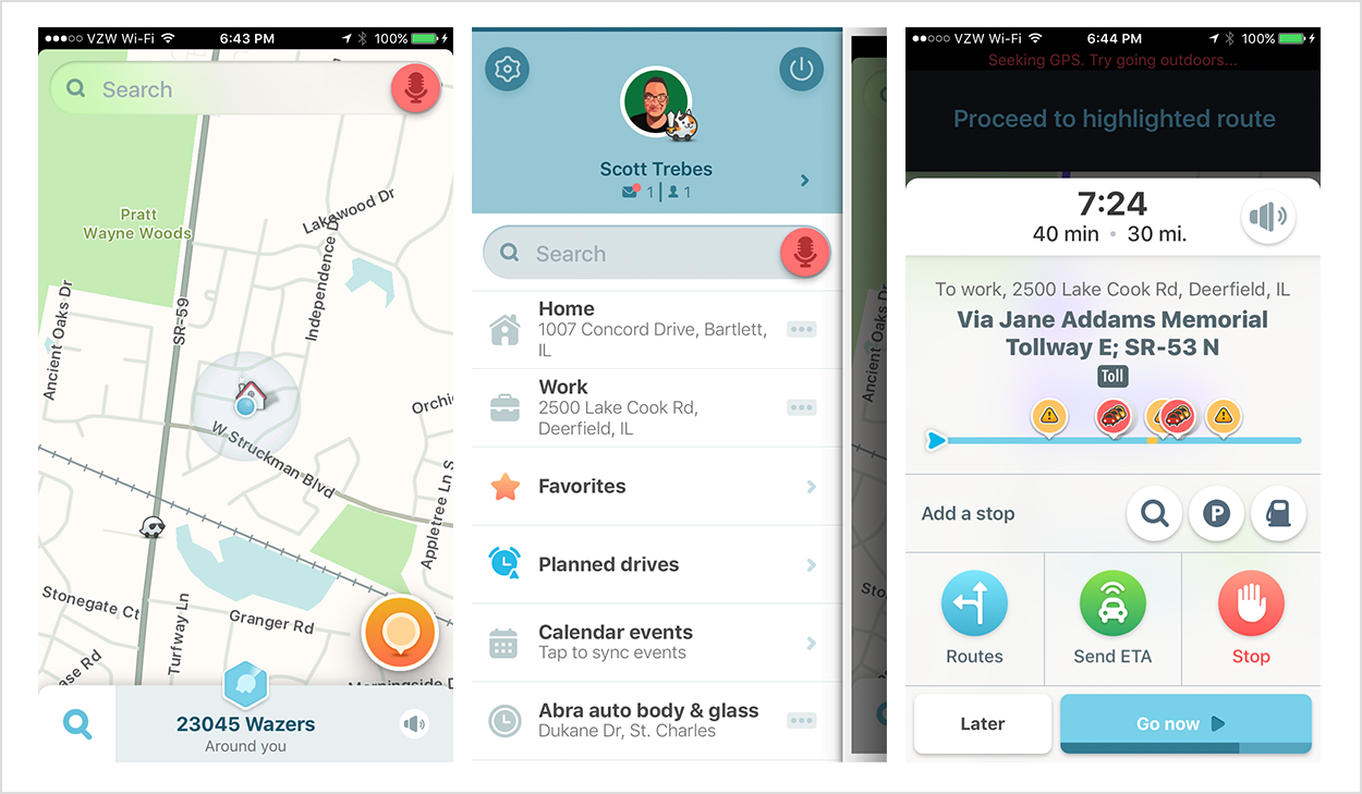
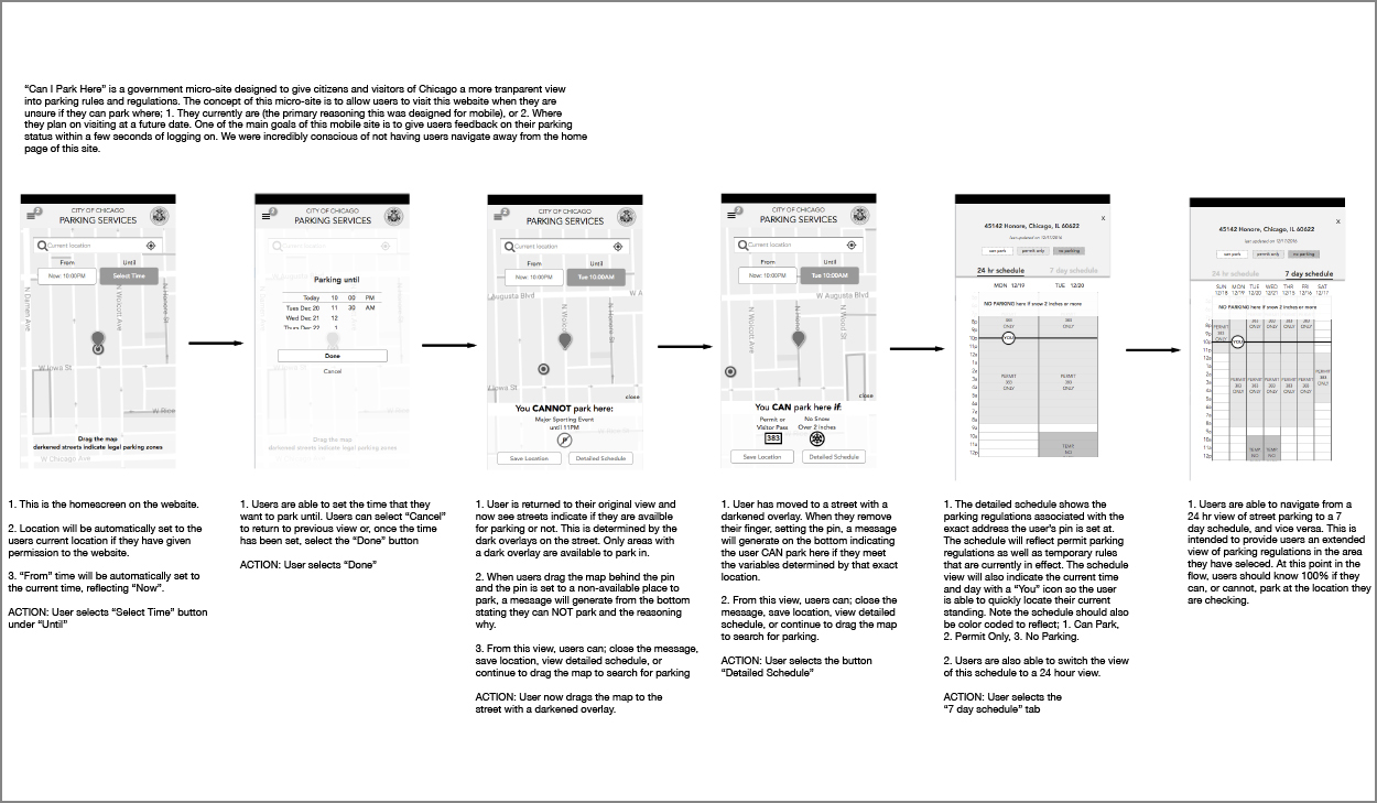
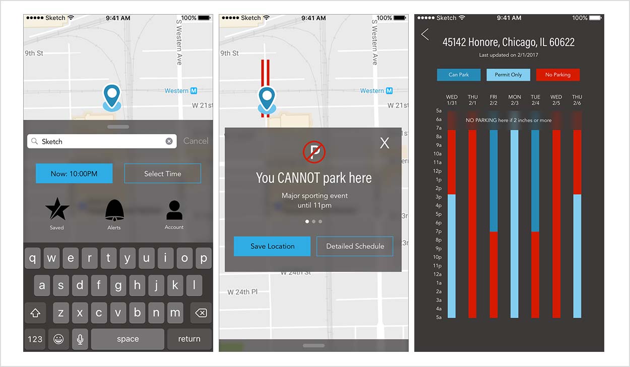
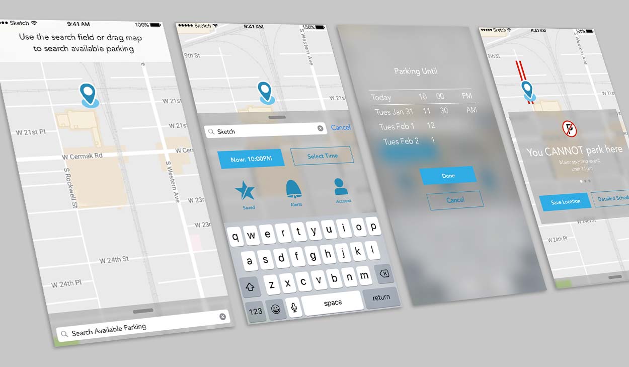
I chose InVision to create my prototype for its ease of use. In the prototype the user will go through a typical flow that results in 3 possible parking scenarios. When the user opens the app they are greeted by a welcome screen followed by a view of the map and a search field. The user has the ability to either enter their information in the search field or drag the map under the drop pin. The user chooses a timeframe to find out if they can park at this location or not. The beauty of the app is that the user is not required to login to use it, but the user can set up an account if they choose to do so. The benefit of setting up an account is that once a user sets up an account their favorite locations are saved for later use.
View demo
I created a marketing site to give users a better idea of what they can accomplish with the app. For the marketing site I used imagery to help the user understand what it’s like to park in Chicago. This would make them want to avoid the frustration and get the app. I felt that testimonials were a good way to make the app appear trustworthy. I designed a responsive mobile version of the site so people on the go can get information about the app.
Final Thoughts and Conclusions
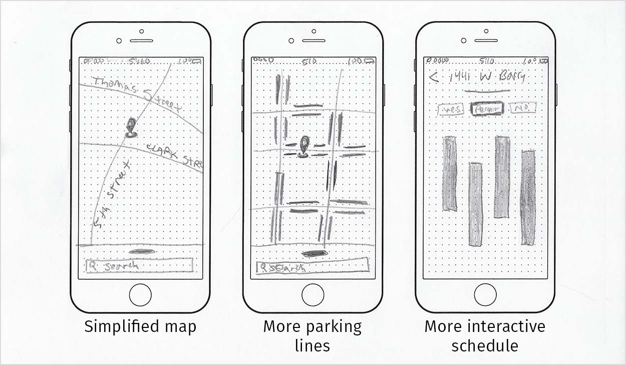
In the future state of the app I would further enhance the map. I believe the more info provided to the user will empower the user to make better decisions in parking. I would do this by adding more parking lines to give users a better idea of where they can park. The more park lines there are the faster the user can find parking. I would also like to make the schedule more robust to give users more options to view. I would make the schedule more interactive. I can do this by making the legend tappable buttons to isolate when the use can or can’t park. I feel that users would want a simplified map that only shows them partial information might make some users feel less overwhelmed.
This experience gave me a sense of how to carry a project from ideation to creation. By developing a project scope, I learned to focus my efforts to create a polished product. It also taught me how flexible I need to be to get the tasks done. What I mean by that is there were a lot of deliverables due so I had to use my time wisely. This meant that I had to time box tasks and move on to different tasks if I got stuck somewhere. I also demonstrated flexibility when I chose to change my UI from dark to light. Understanding the greater good of that design choice helped me accept it and move on.
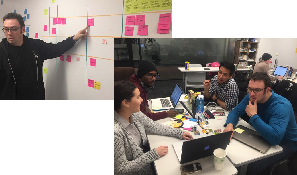
Desirability testing didn’t come naturally to me. I stumbled a little bit in the first one due to nerves. What helped me was realizing that people naturally want to be helpful. With this understanding, my confidence grew tremendously and was evident in my remaining tests. Working on a team taught me a great deal about accountability. Using a scrum board for the very first time helped me stay on track. Promising deliverables and getting them done at a certain time made me feel accomplished and felt very rewarding. There was a good dynamic between team members, we all respected one another. Each team member developed their own designs, but we worked together on:
- • design principles
- • visual competitive analysis
The biggest thing I learned more about from this project is critical thinking. In the past I never had done any visual competitive analysis. The importance of learning what competitors can teach you has been invaluable to me. I learned how this data can shape my design path.
Working on this project helped me a lot with my next and first client project, ChiTAG. I learned to prototype using InVision and Proto.io where I built clickable prototypes quickly for user testing. I learned techniques to create realistic animations for microinteractions. This project also taught me the importance of creating and updating style tiles as they helped me keep my UI consistent. This was even more important when the UI went from dark to light. Finally, I learned to get over my fear of presenting. At first I would get easily tripped up on my words. Practicing and note cards really helped me gain confidence and deliver impactful presentations.